akatre


Akatre is a French graphic design studio formed by Valentin Abad, Julien Dhivert and Sebastien Riveron.
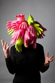
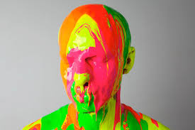
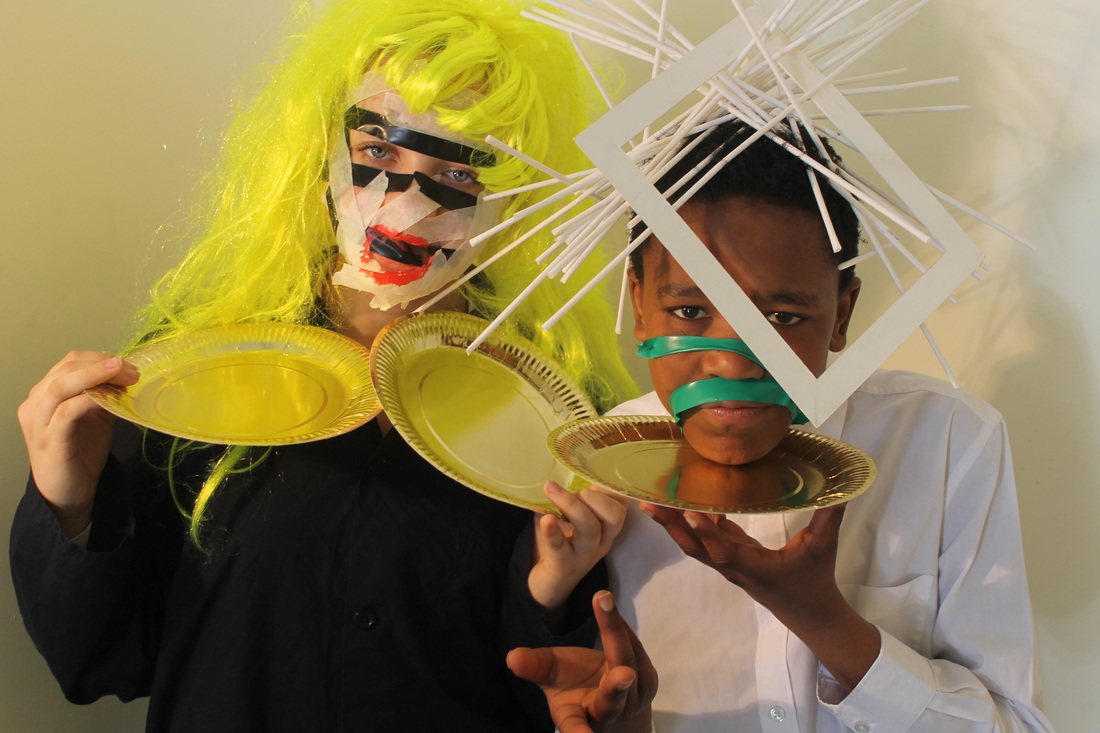
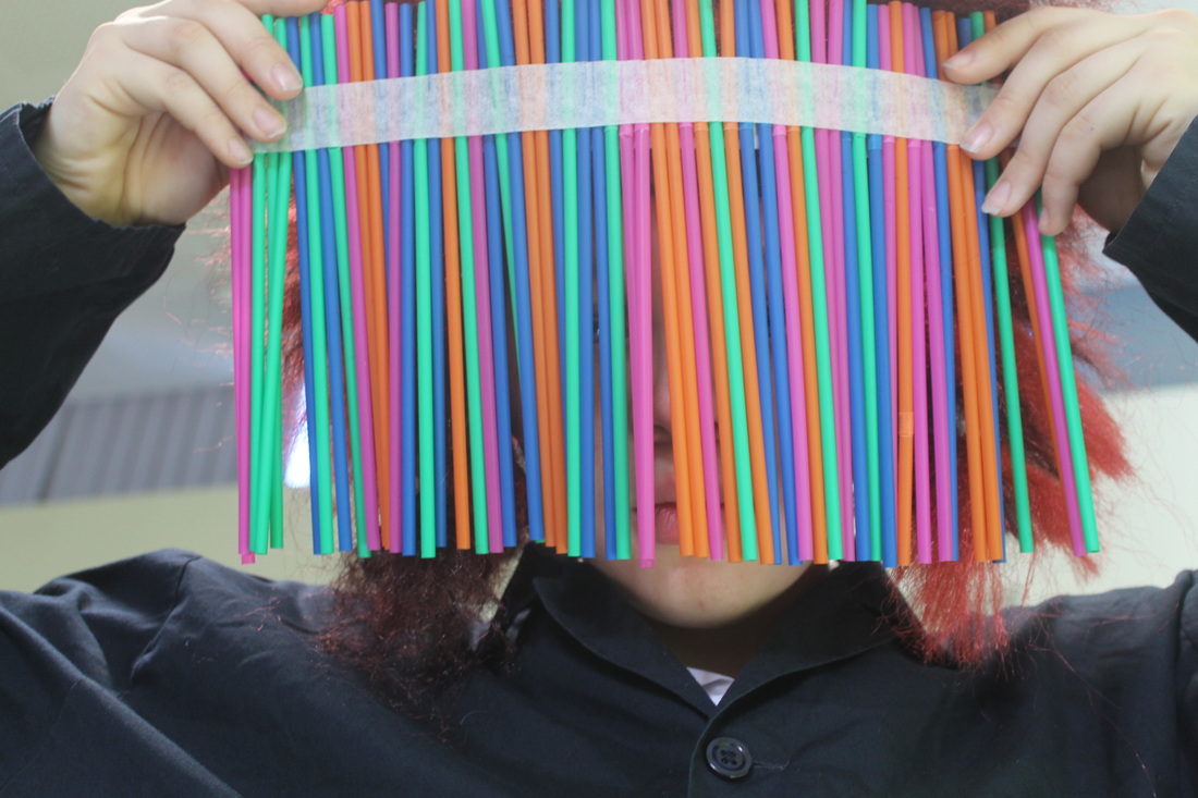
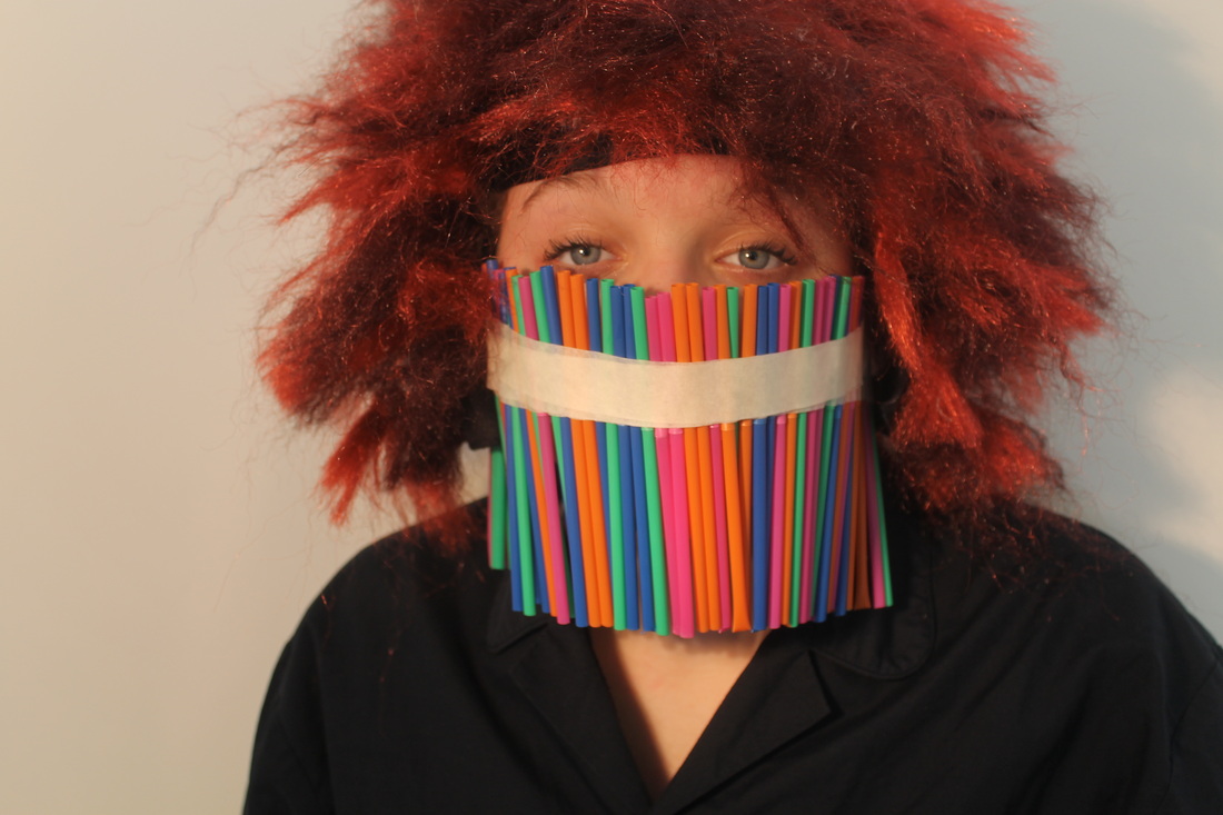
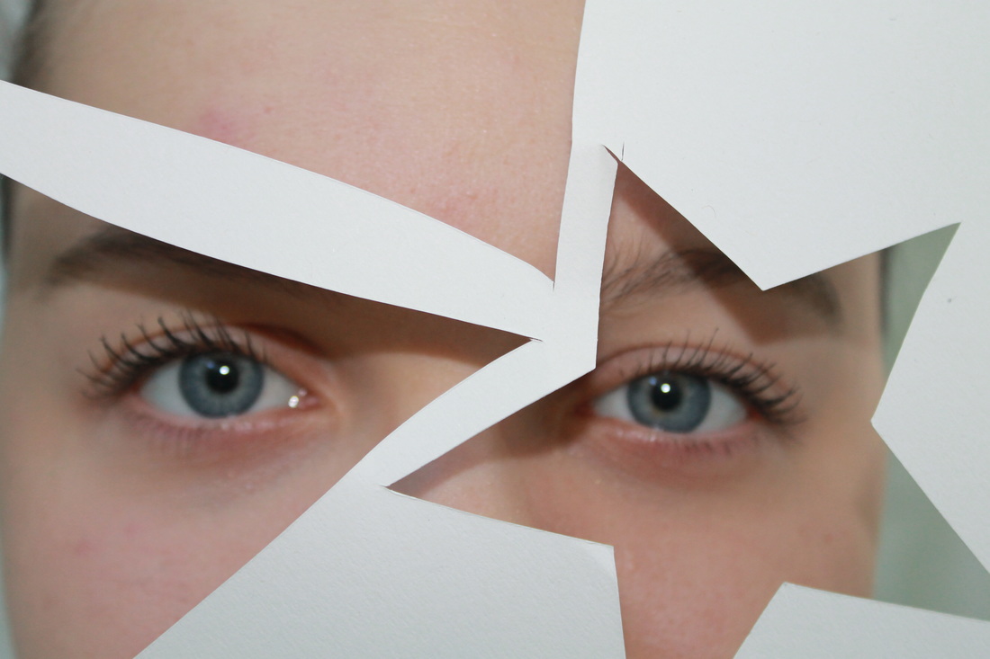
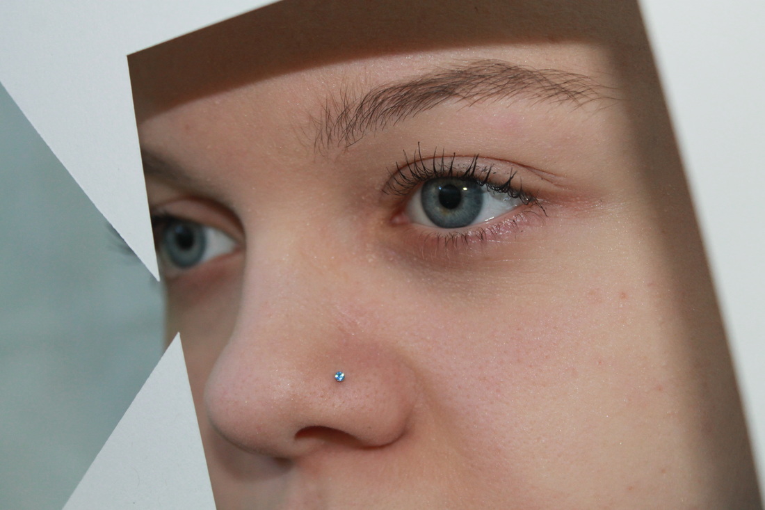
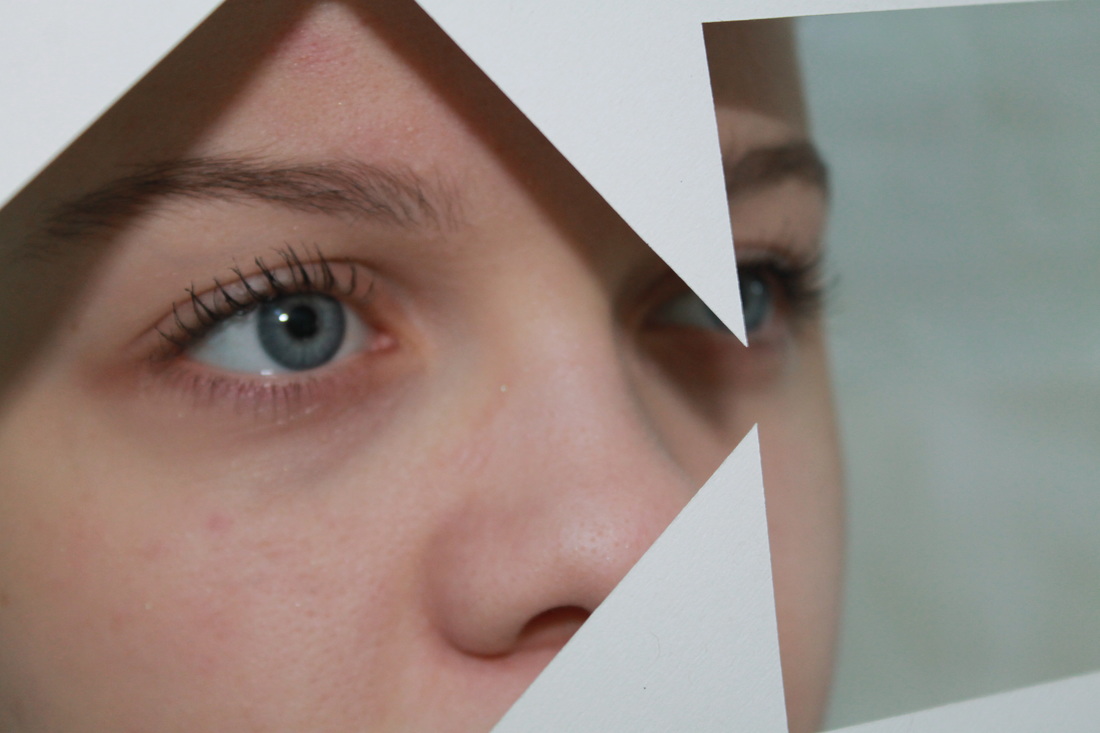
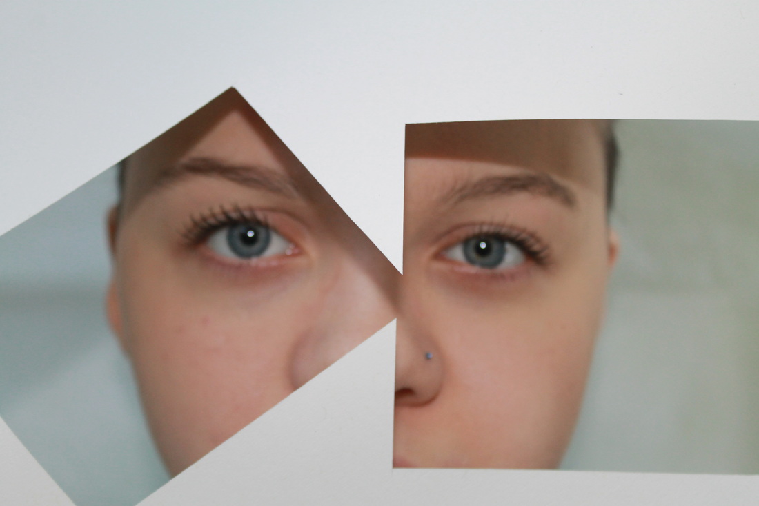
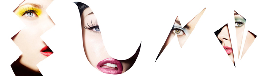
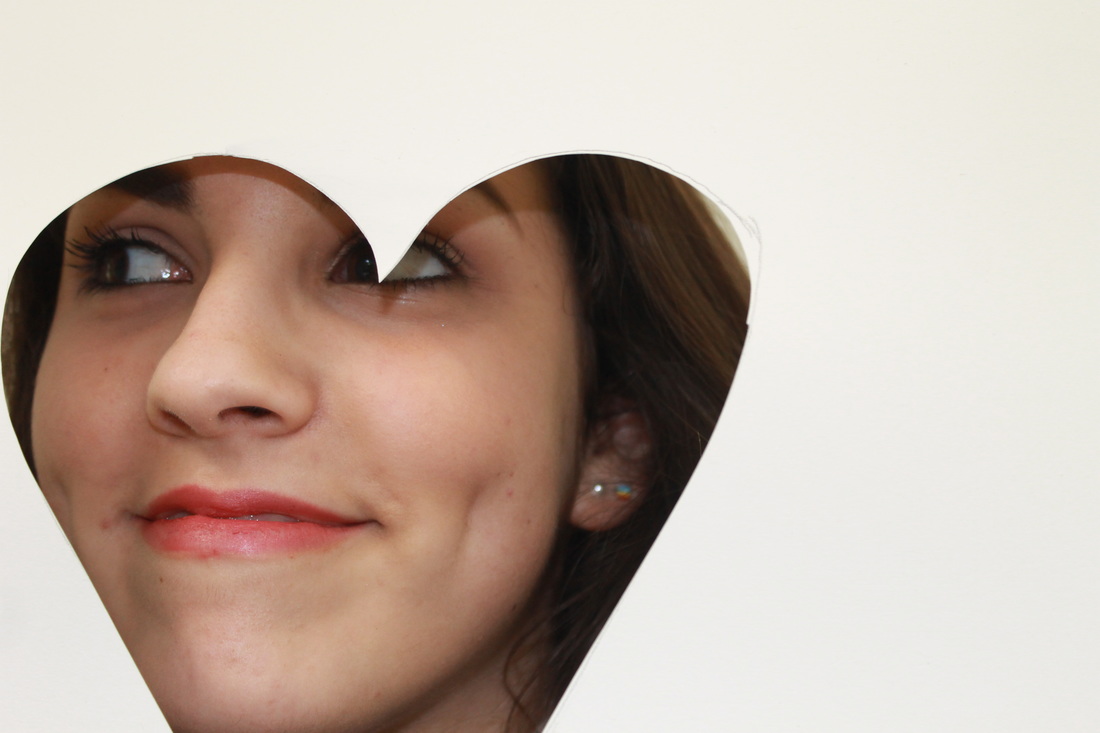
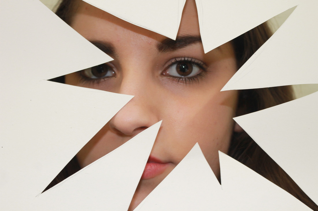
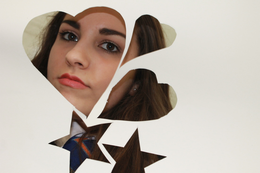
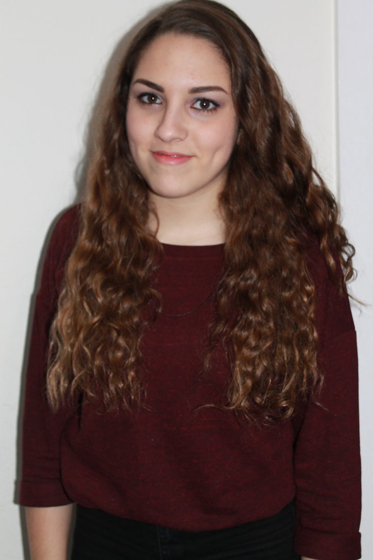
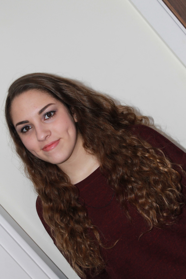
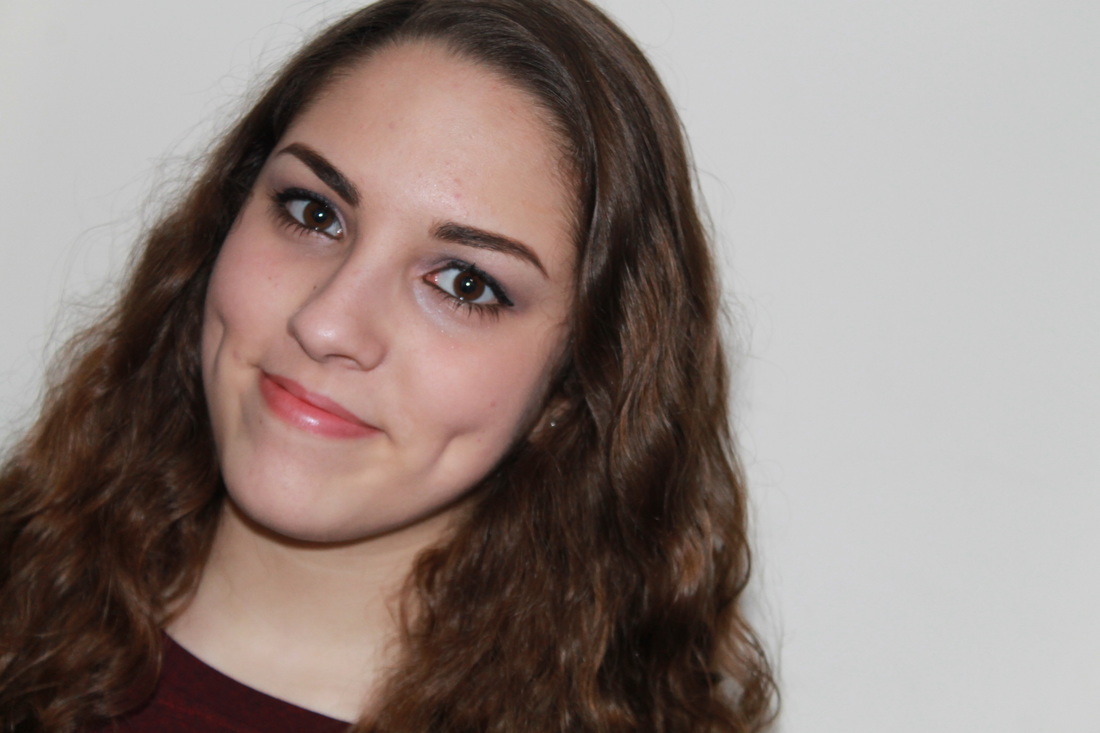
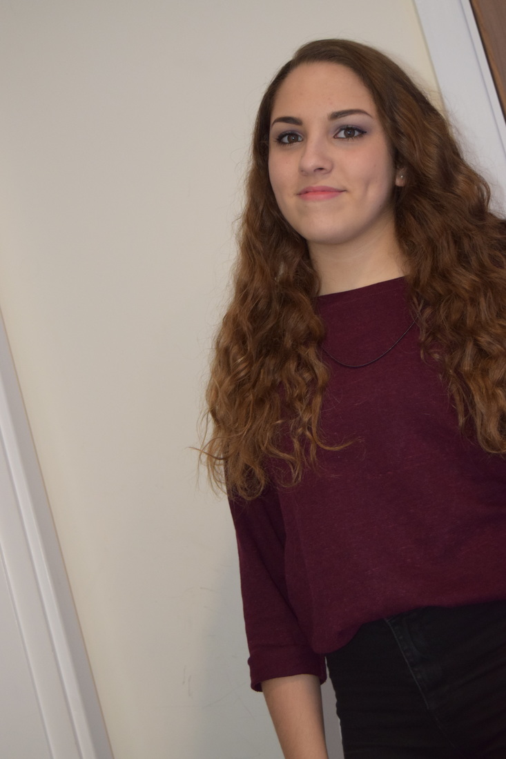
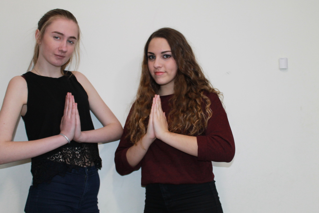
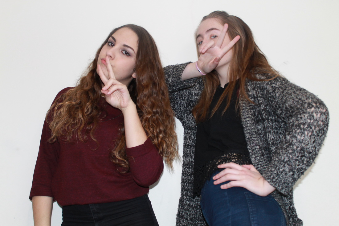
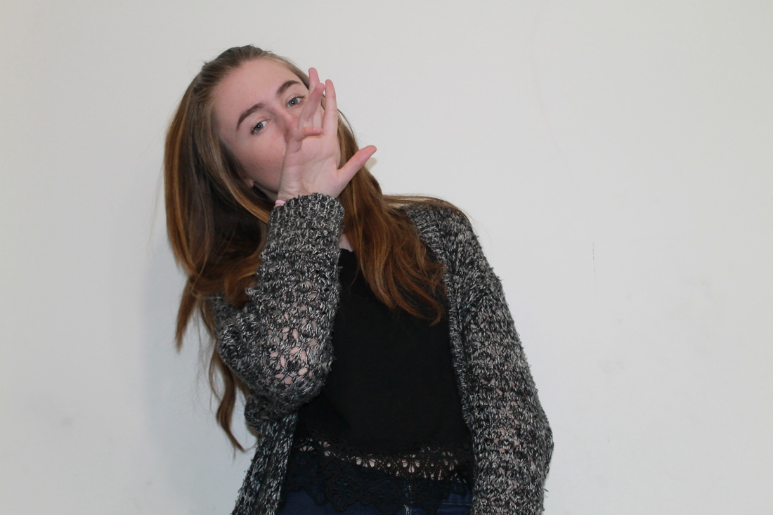
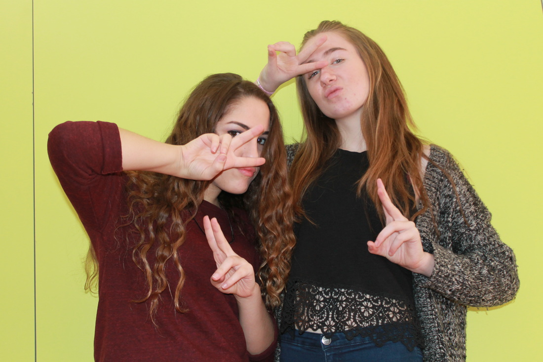
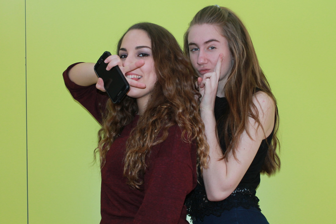
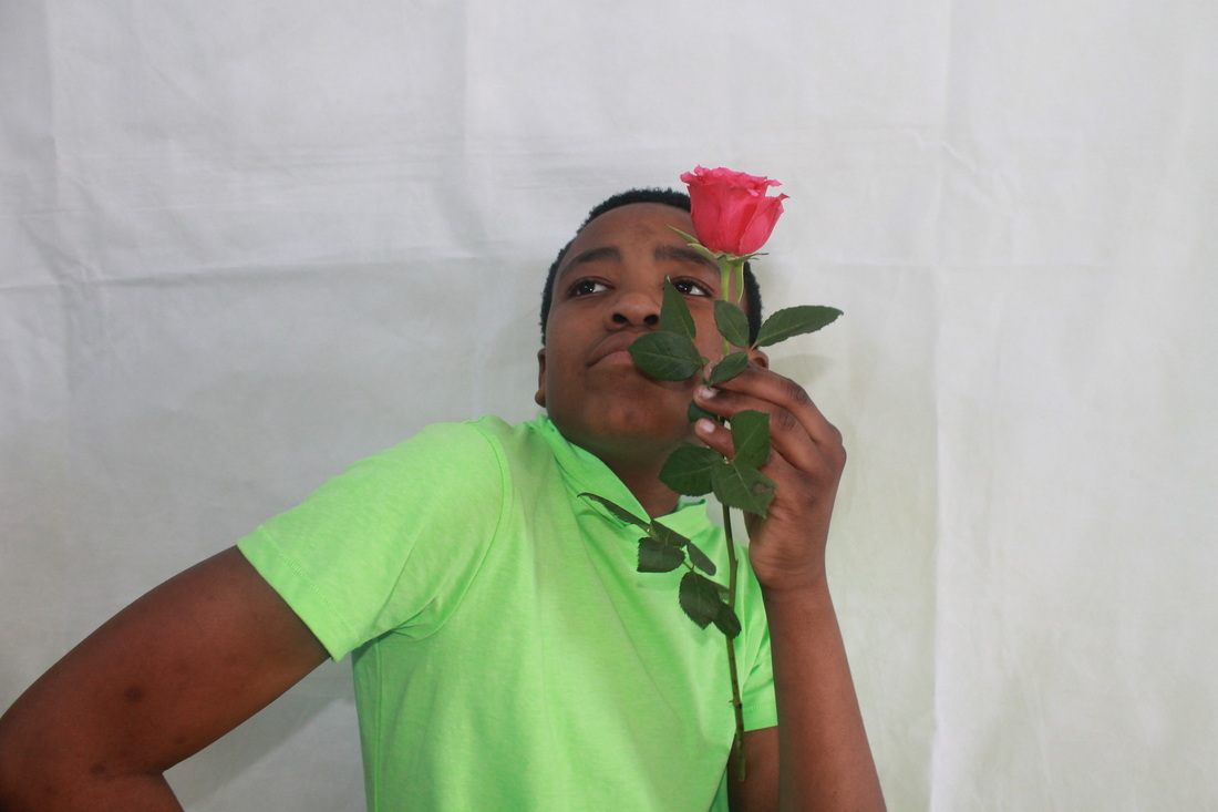
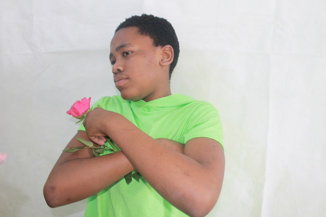
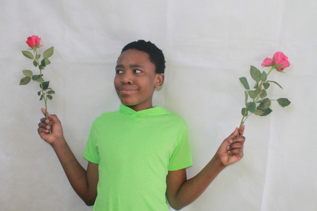
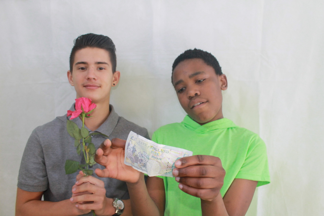
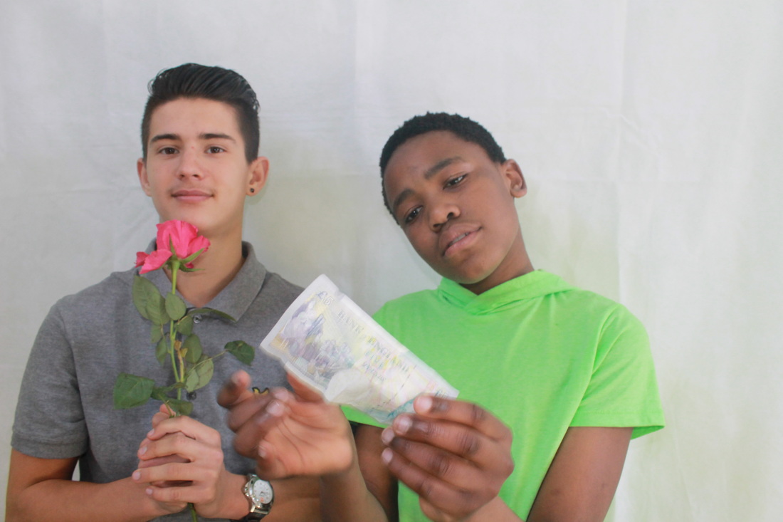
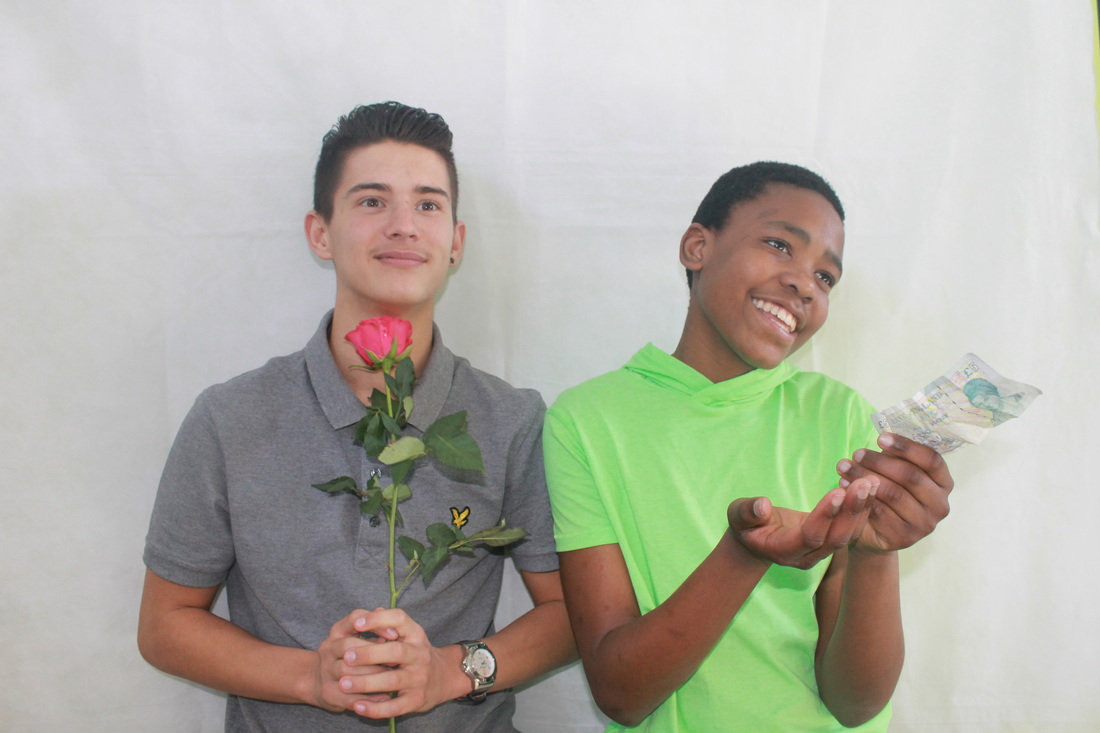
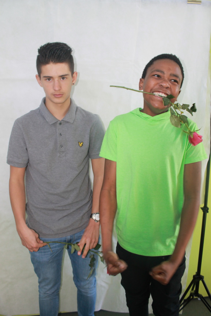
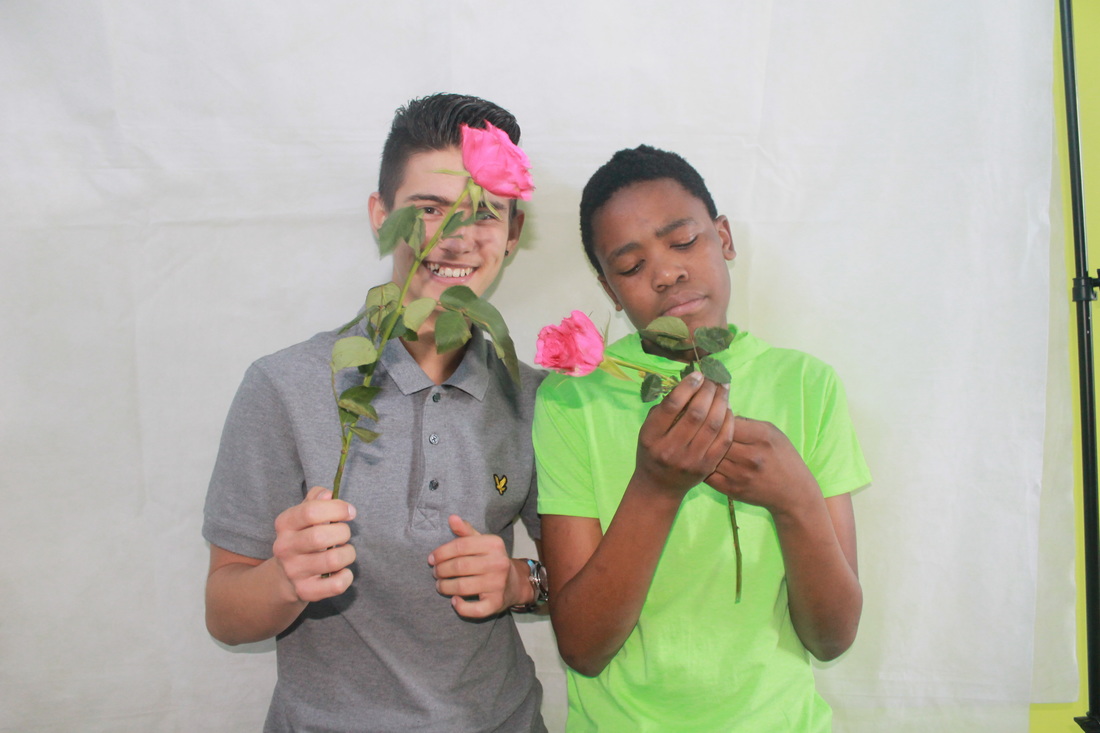
These are some of my photos in the style of Akatre. Akatre is a creative way to identify who you are, you can dress up and pretend to be someone else. Akatre uses different type of objects and materials using creative ideas to turn it into something different from the usual. Akatre are three young designers: Valentin Abad, Julien Dhivert and Sebastien Riveron. They work in a variety of medias including printing, graphic design and publishing to video and photography. Akatre is a French graphic design studio formed by Valentin Abad, Julien Dhivert and Sebastien Riveron. The trio works in a variety of fields including typography, graphic design, photography and video.
my responses to akatre
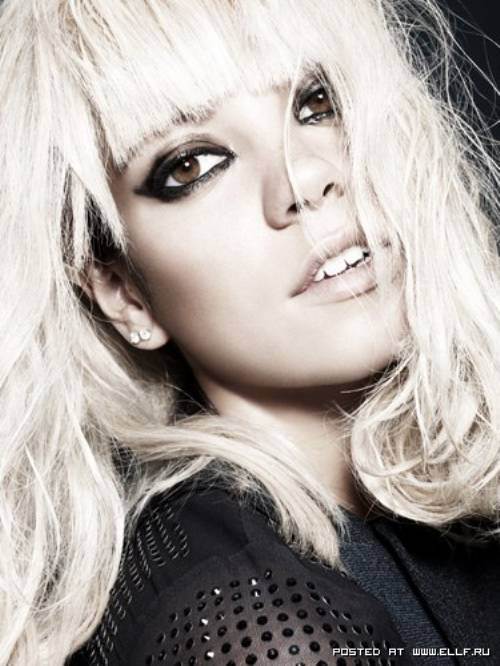
Rankin
He grew up in Glasgow until the age of 10. And then the family relocated to North Yorkshire for 4 years, then he moved to St Albans in Hertfordshire. He had he's photo taken when he was 17 by a hairdresser. He didn't start taking photo's until he was 21. Rankin is a famous photographer. He had worked with many famous people, such as Miley Cyrus, Adele Adkins, James Bond and many more.

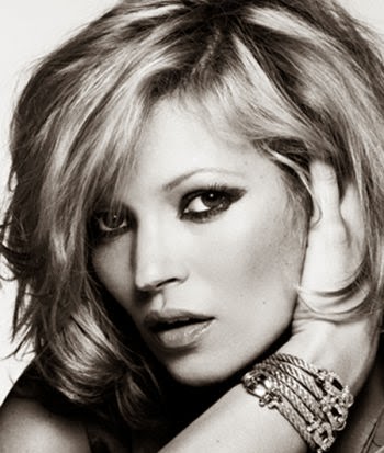
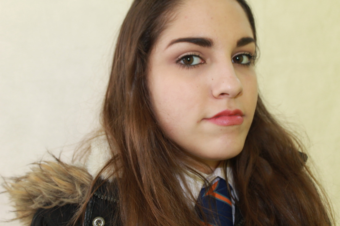
My response to Rankin
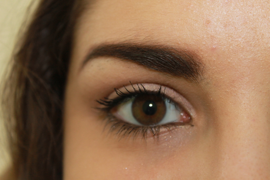


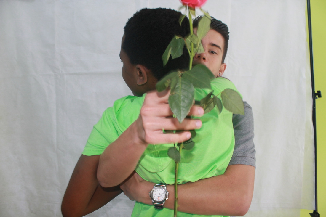
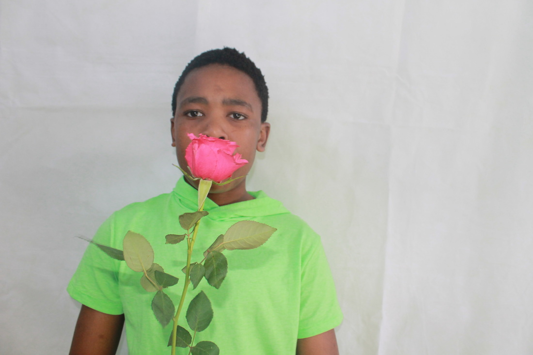
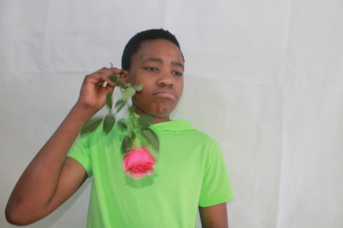
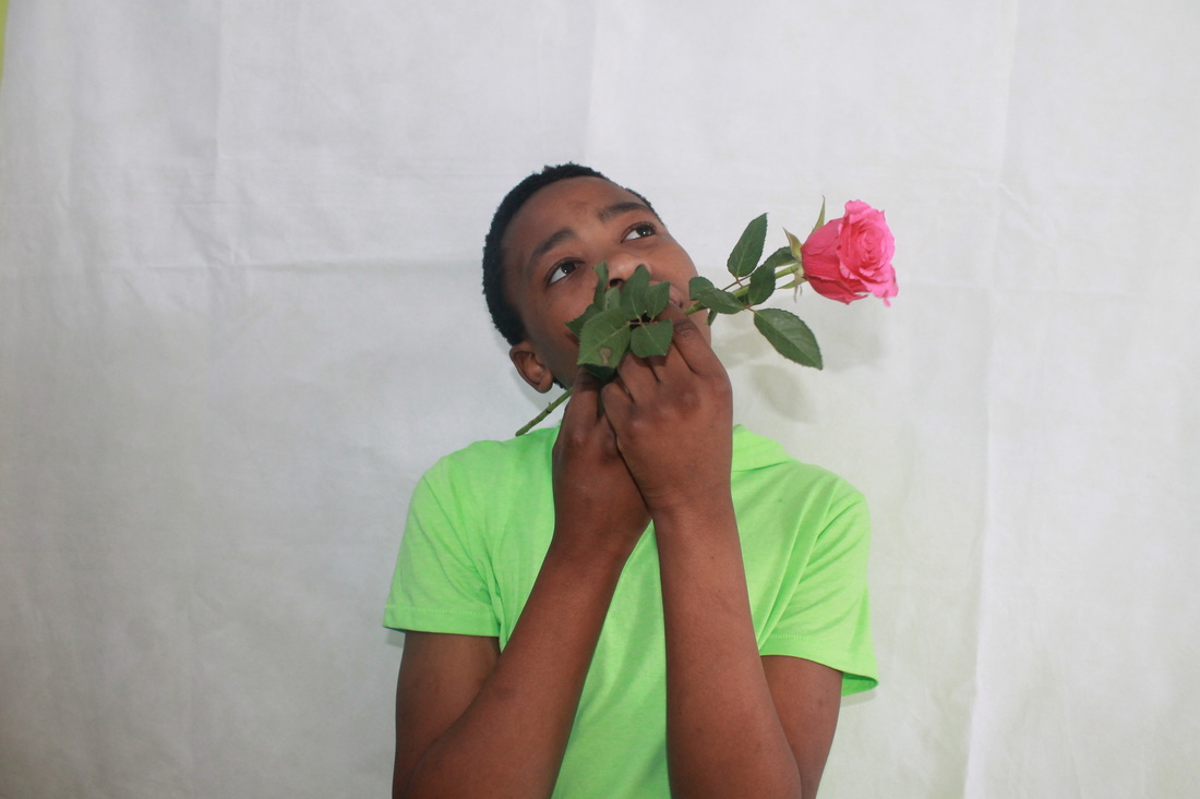
Rankin cut out


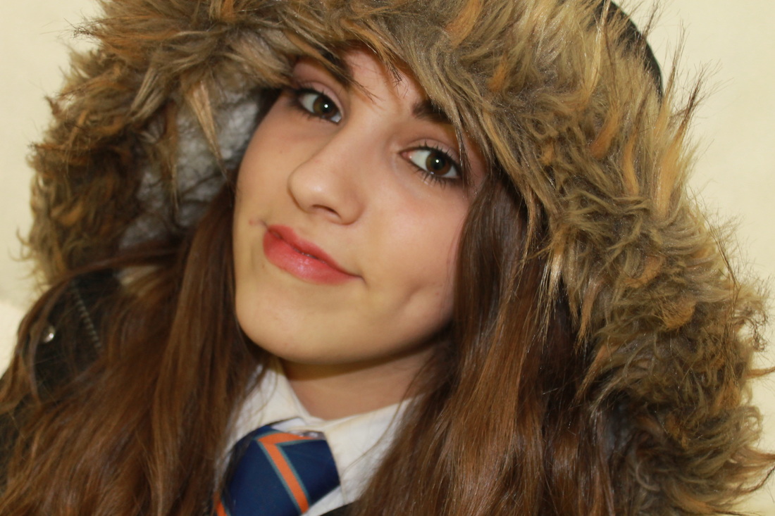
Rankin photo shoot 2
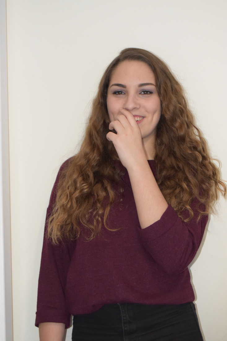
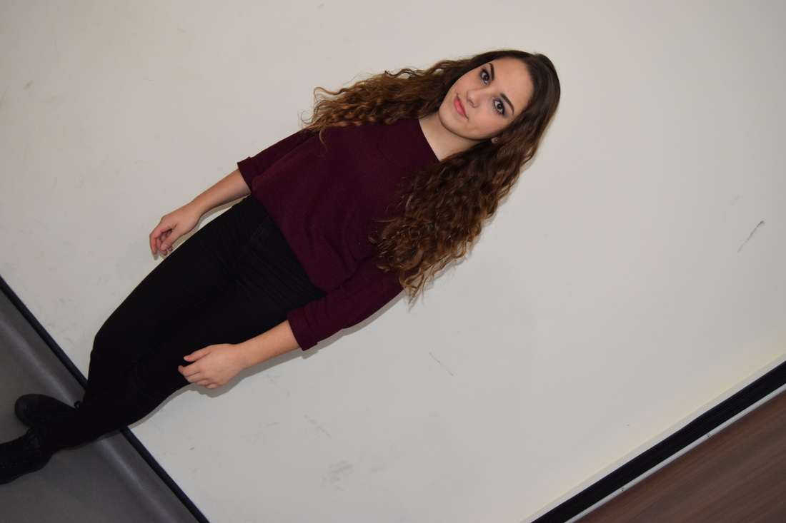
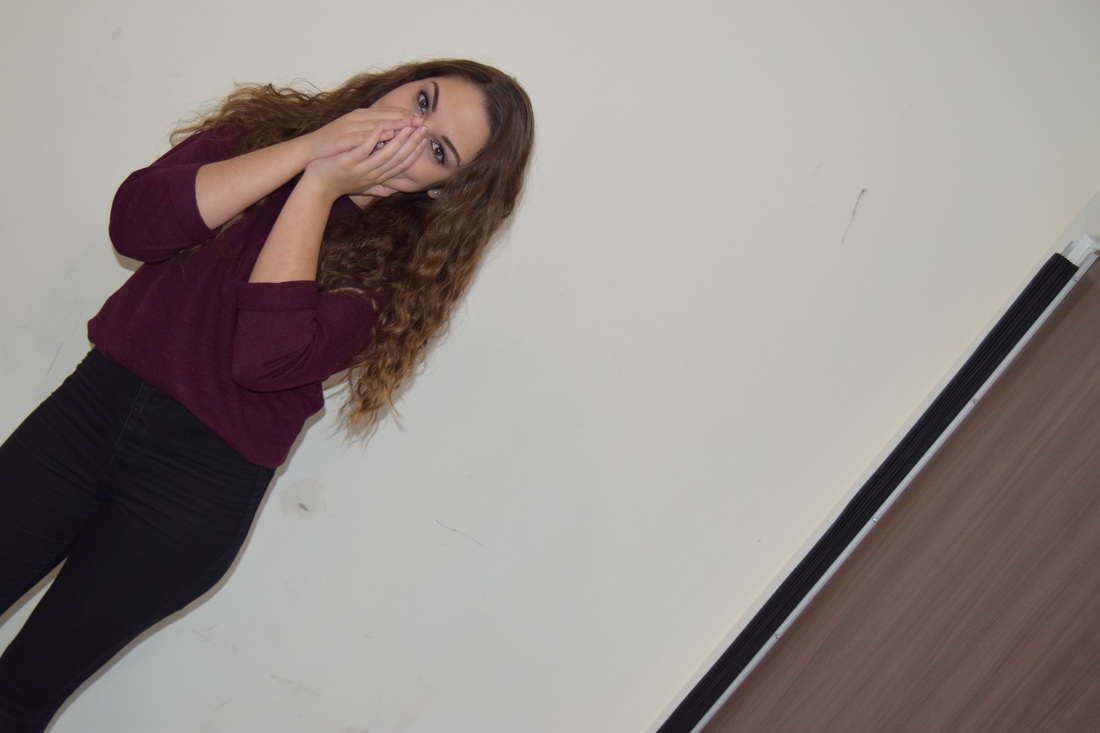
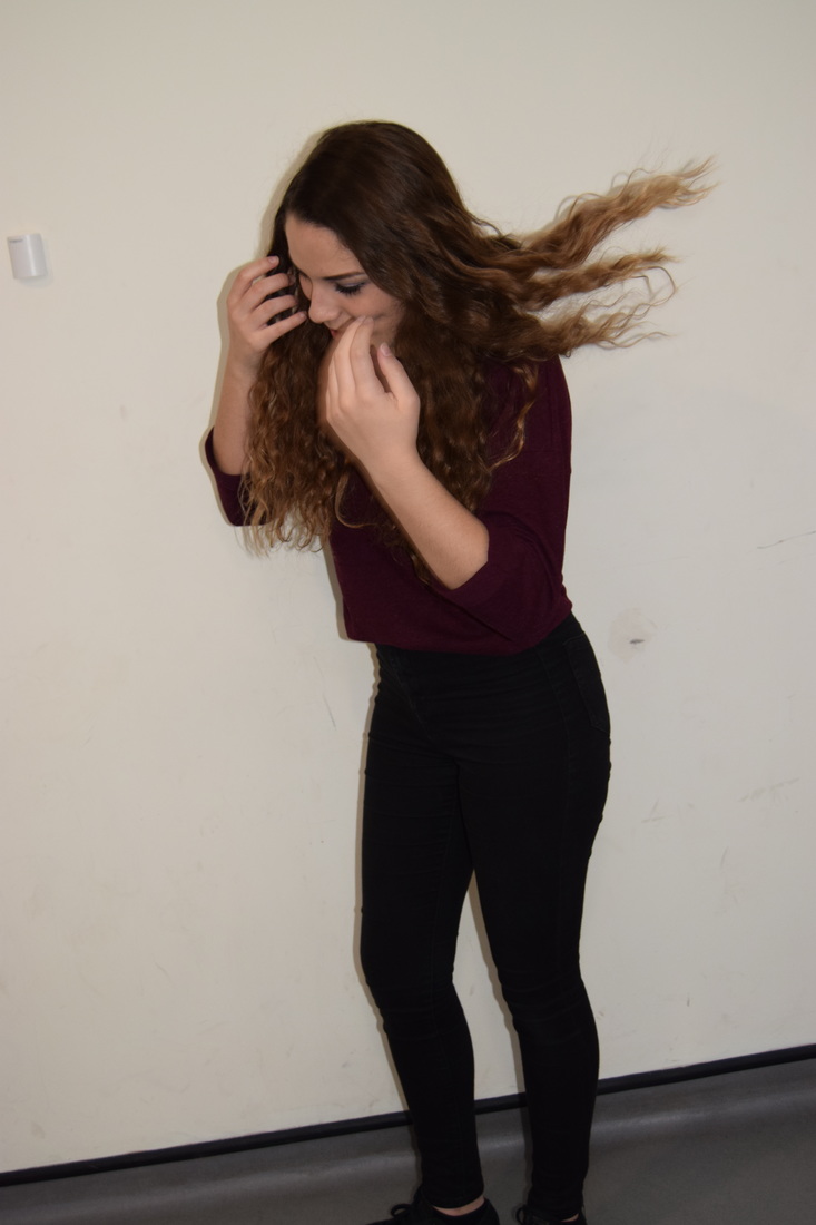
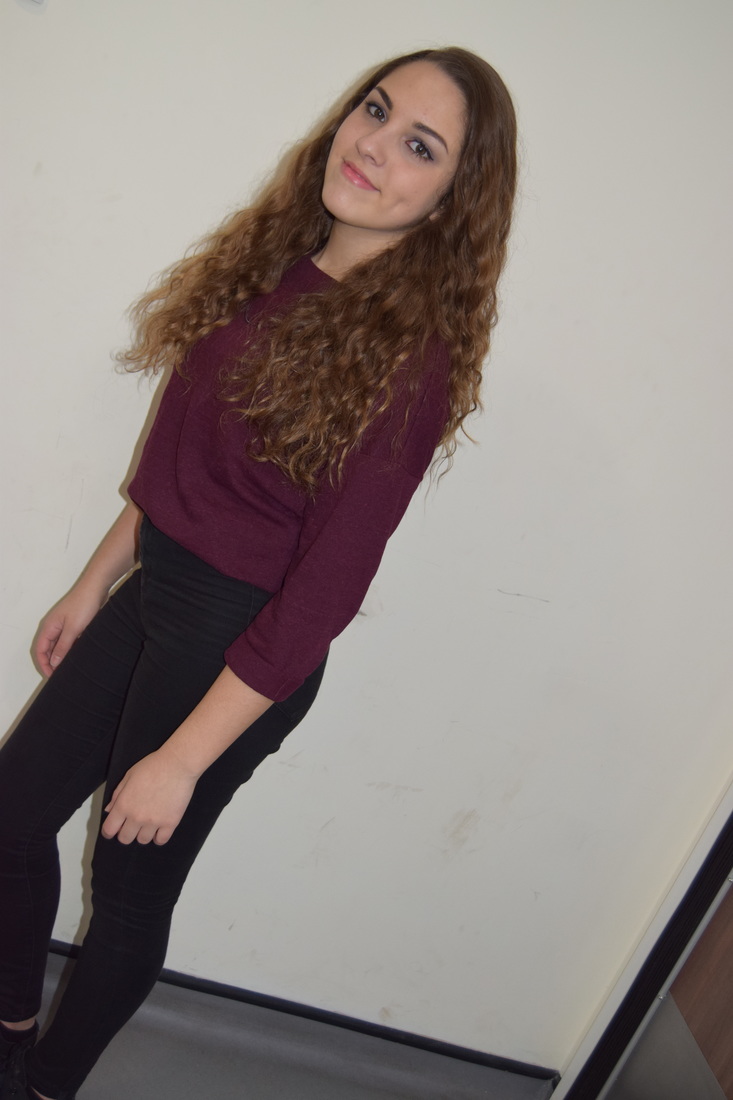
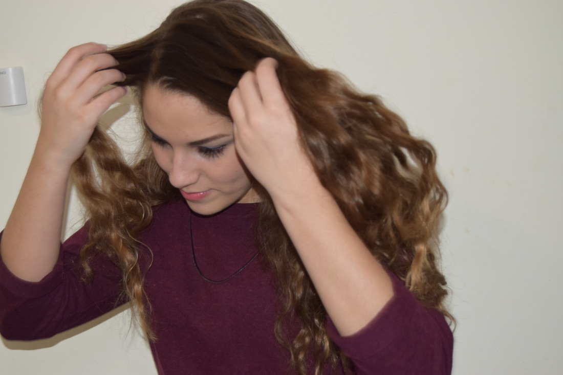
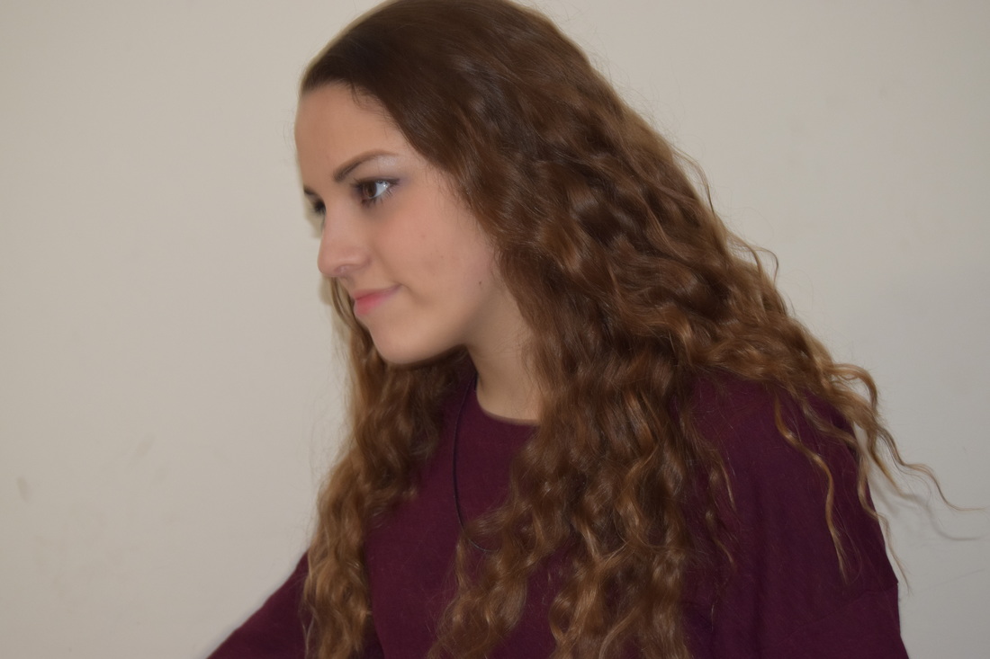
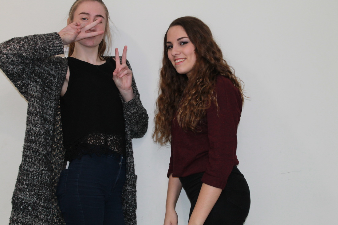

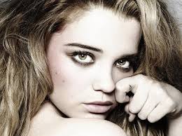
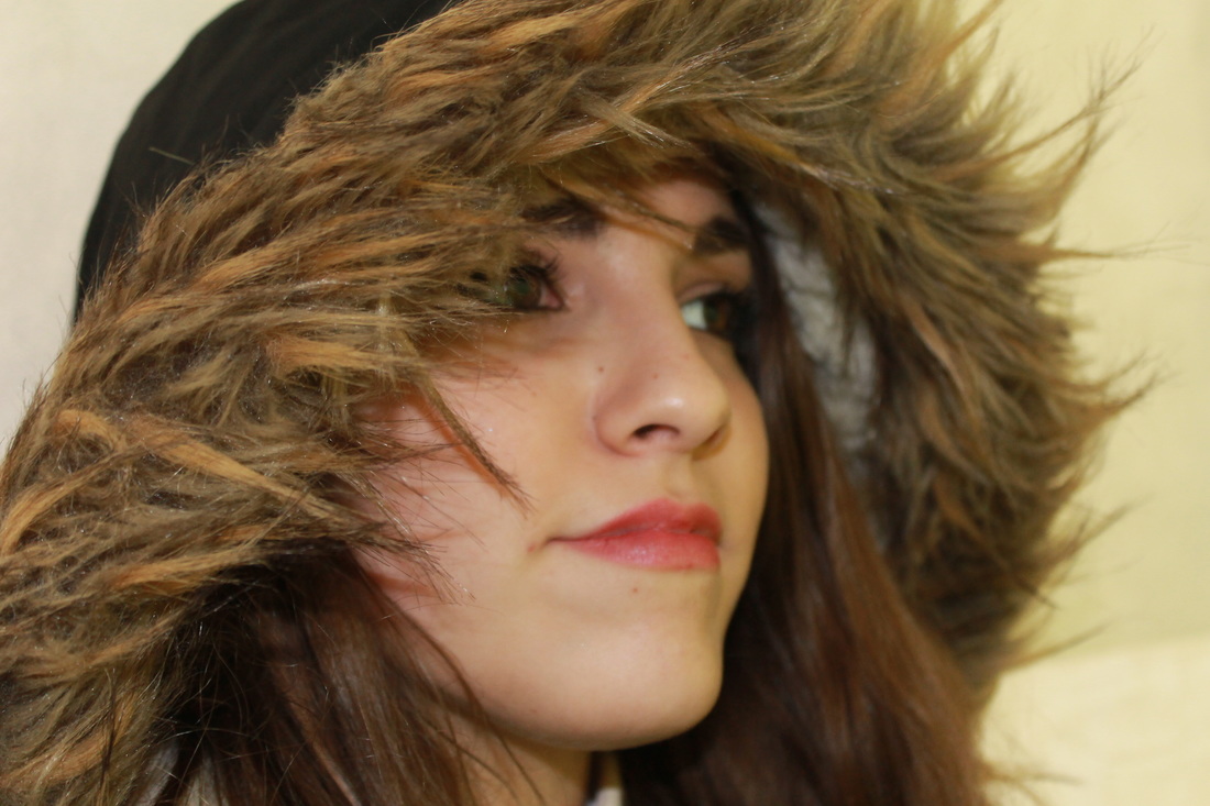
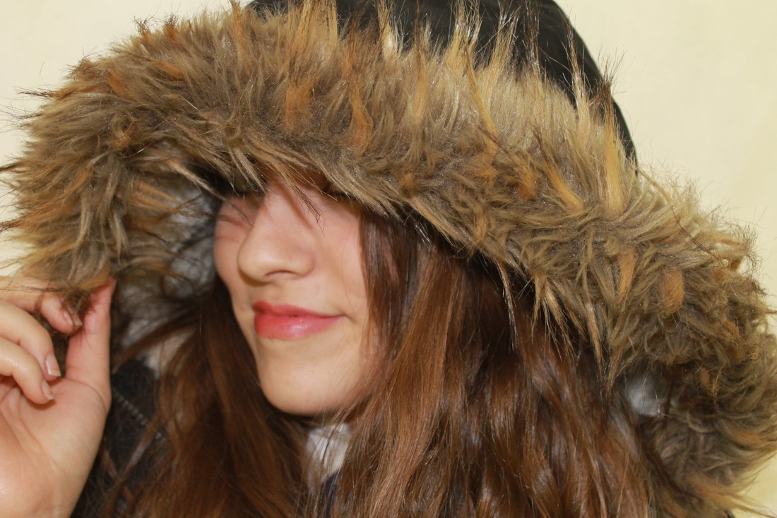
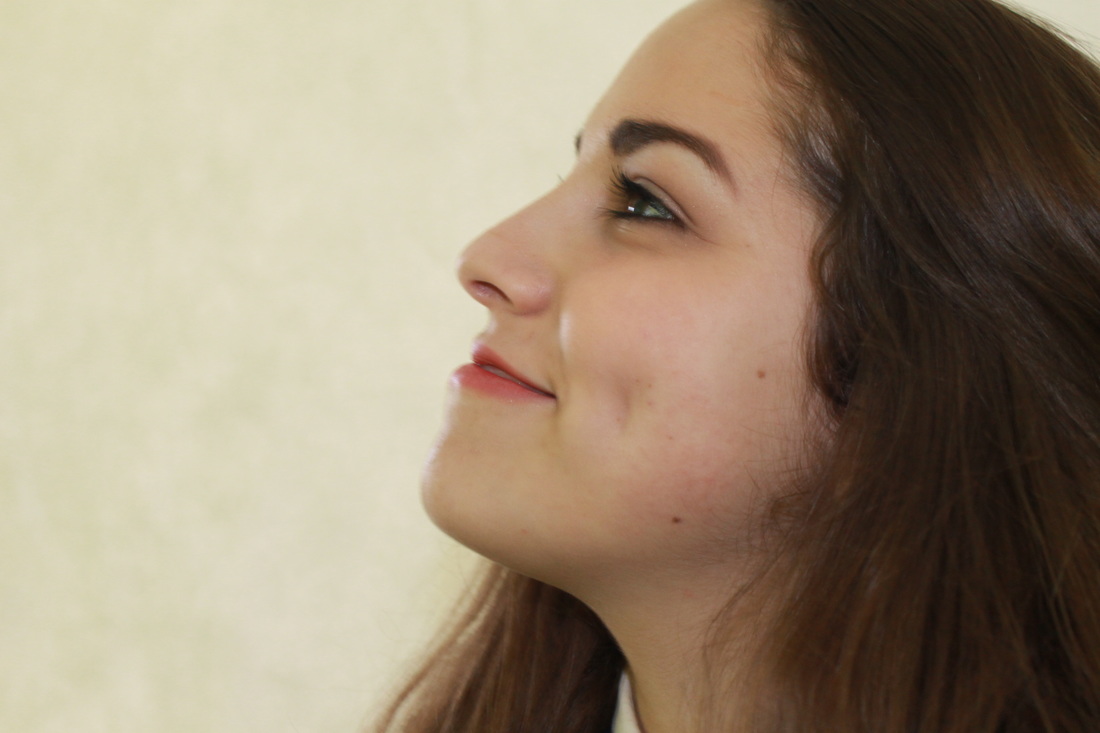
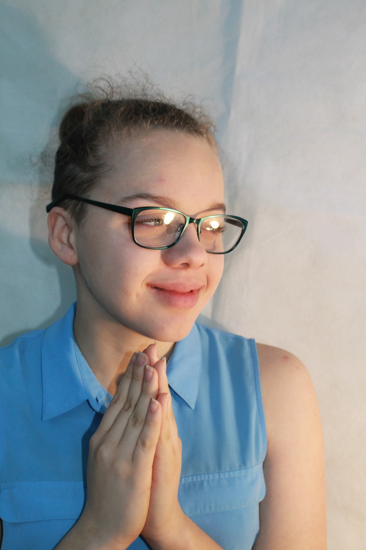
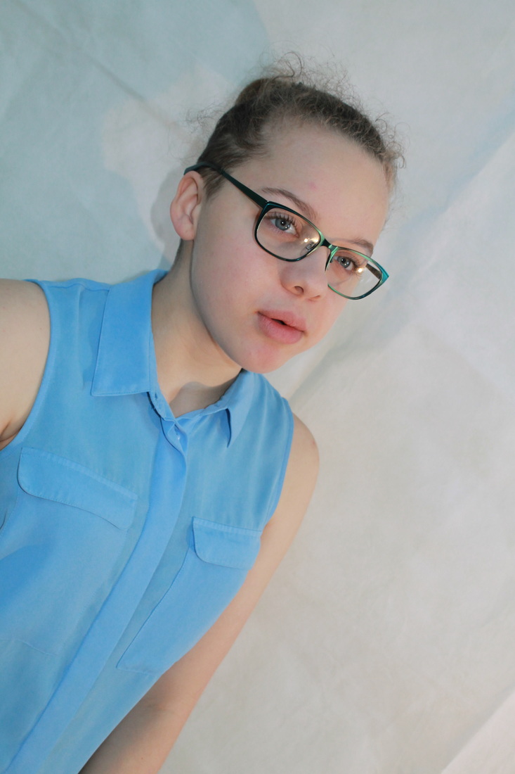
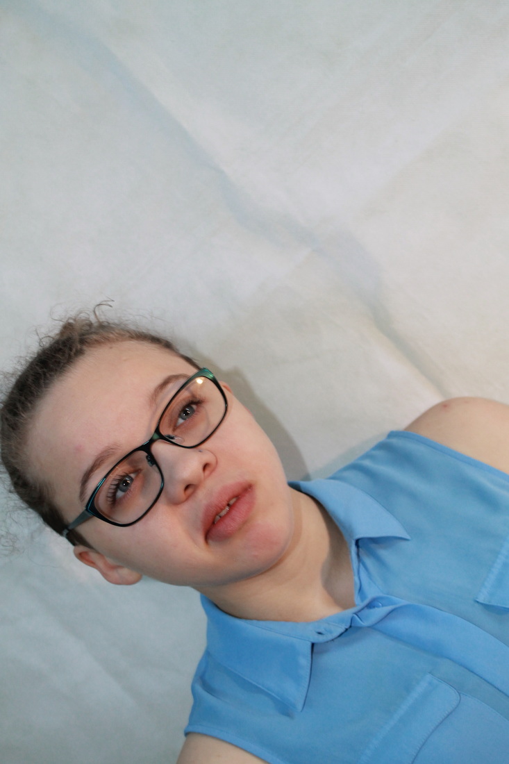
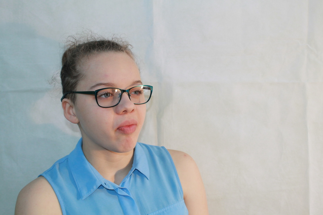
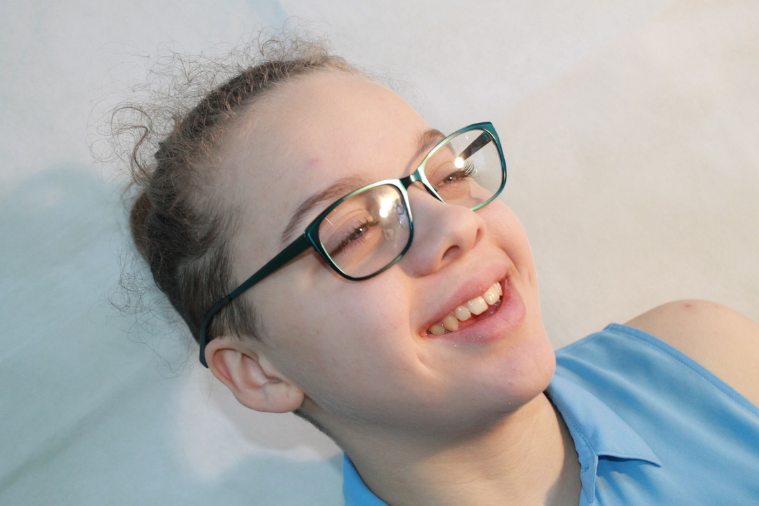
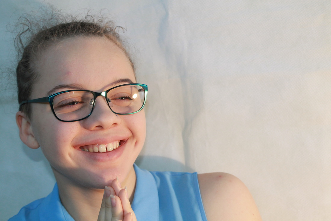
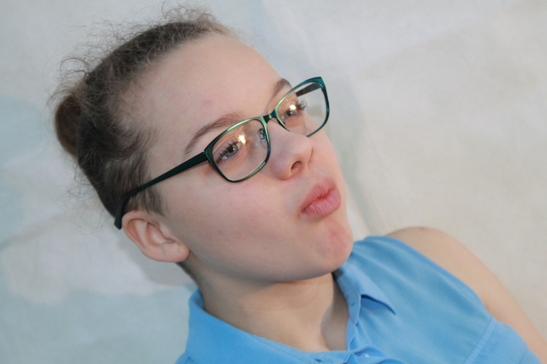
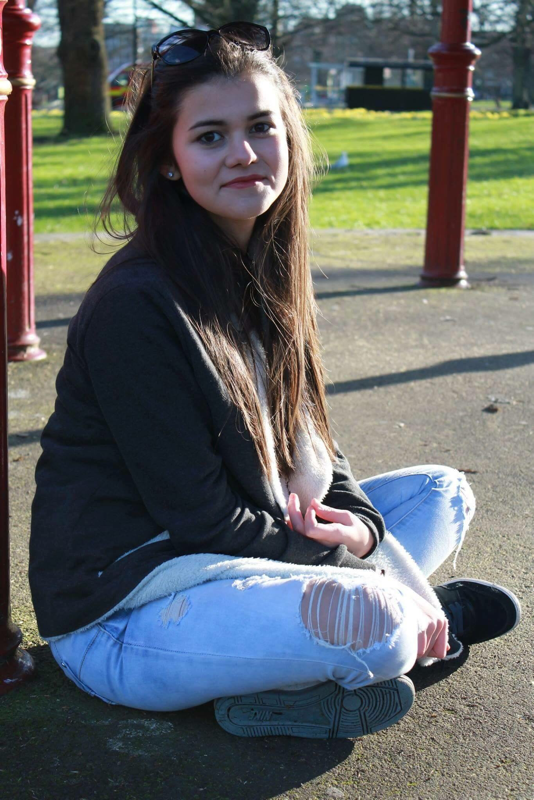
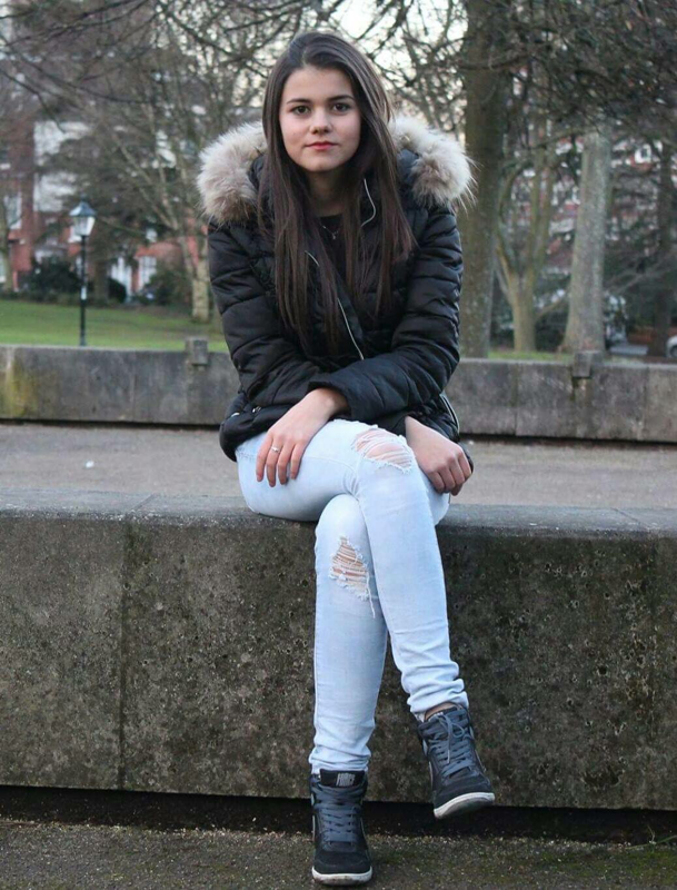
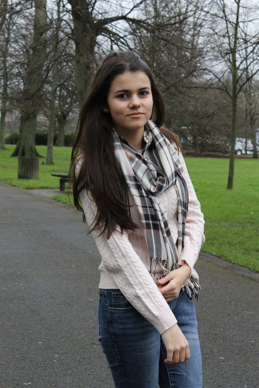
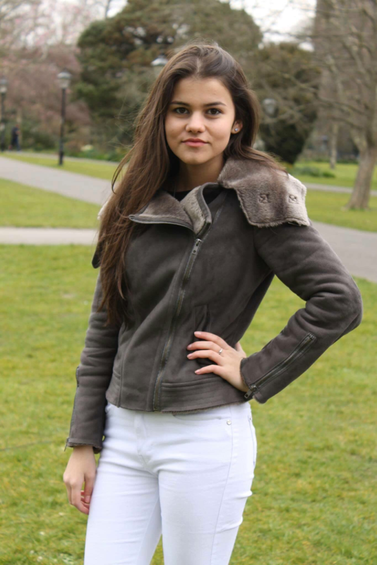
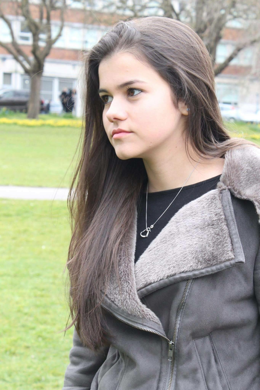
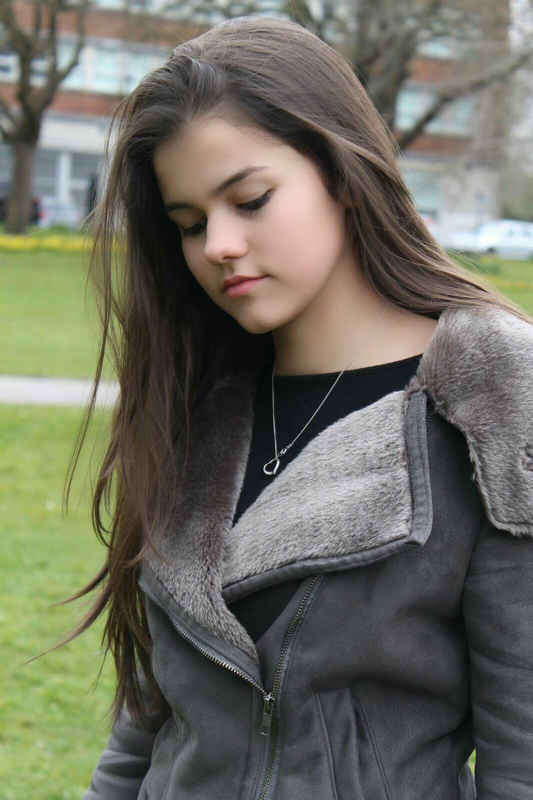
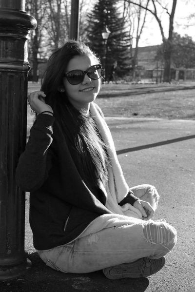
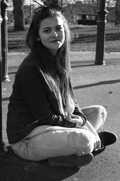
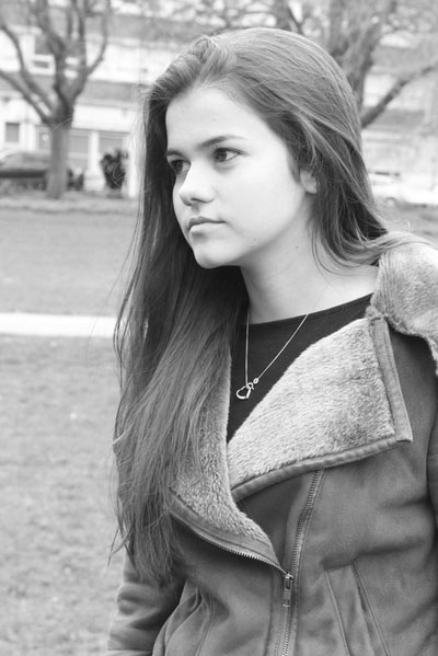
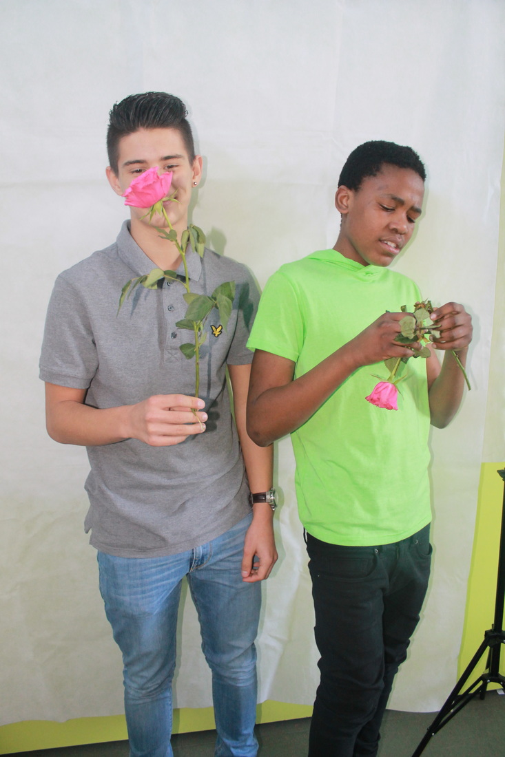
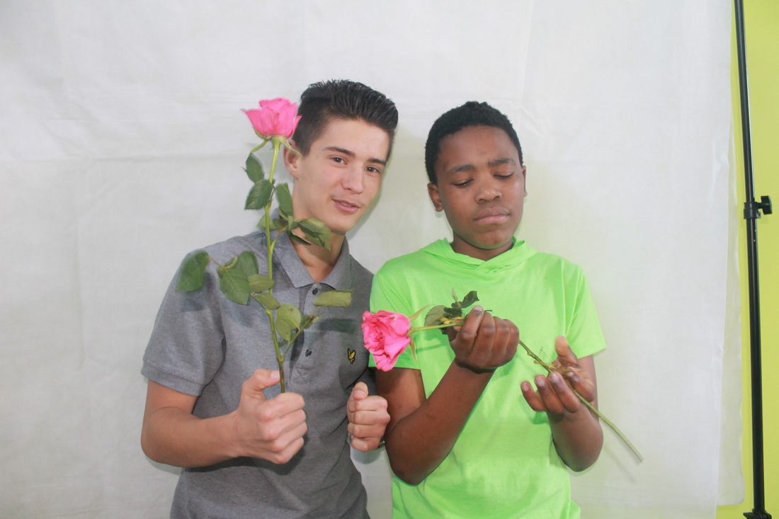
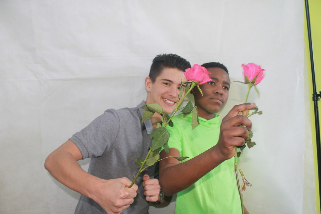
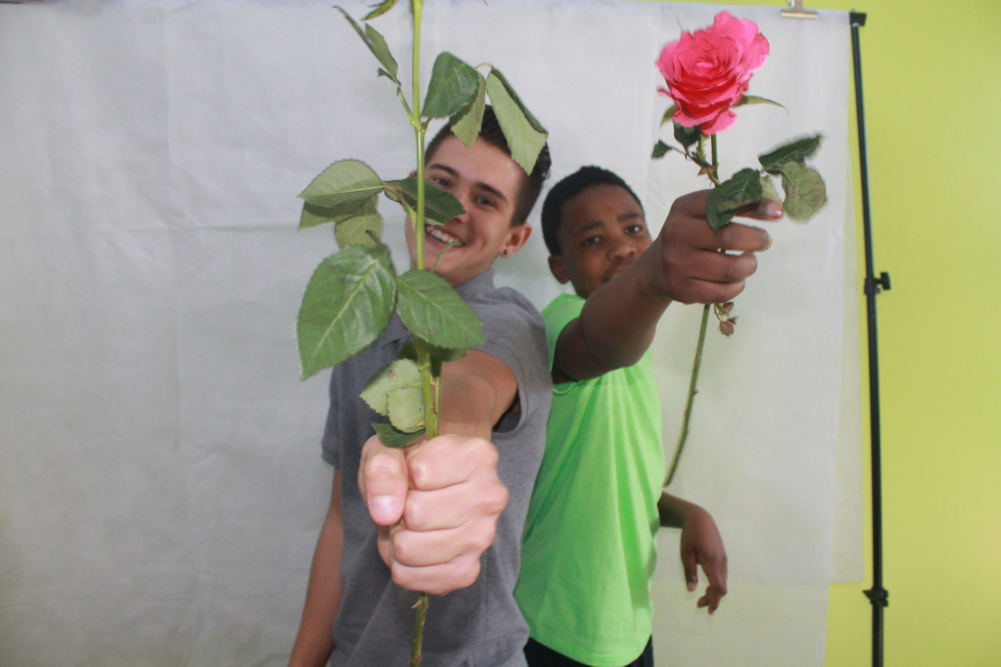
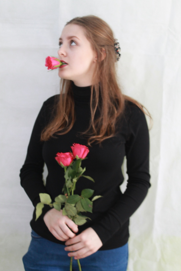
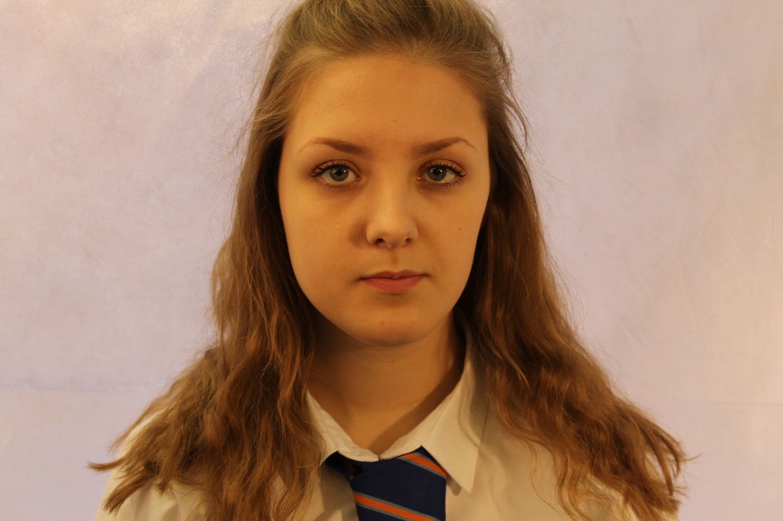
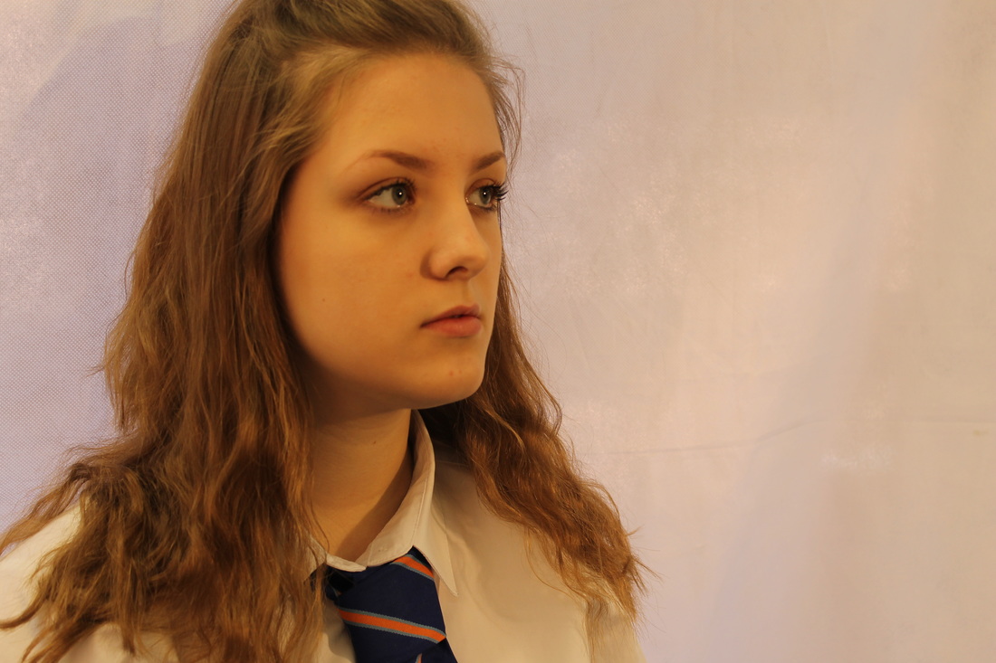
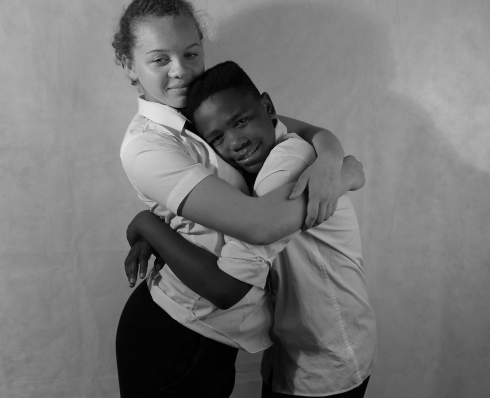
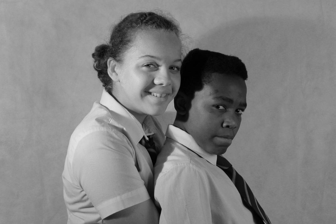
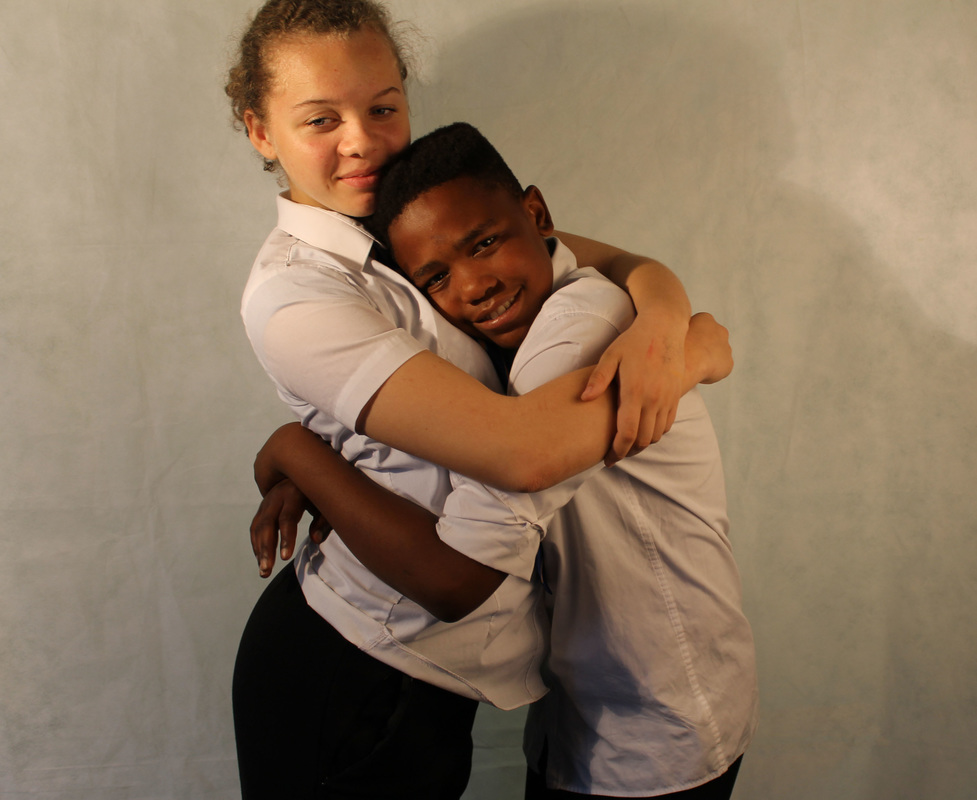
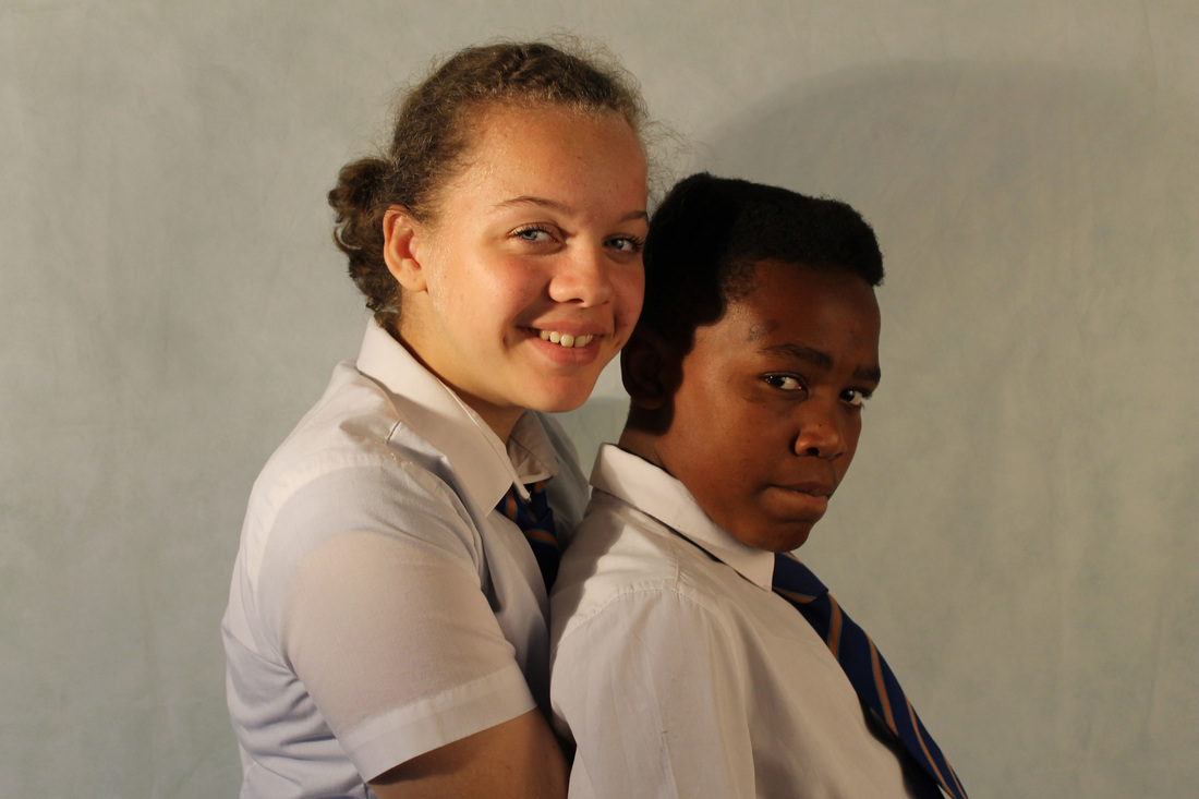
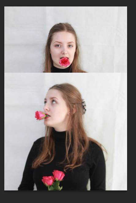
People and places photo shoot
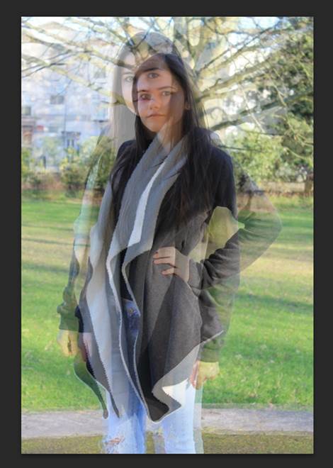
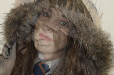
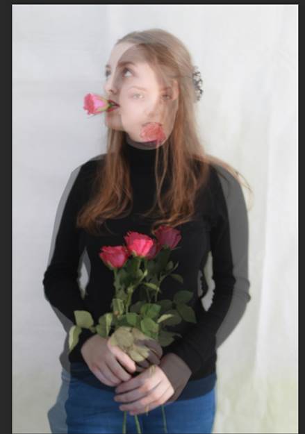
I took two photo from above and put them together and turned the photo into black and white and the other I changed to colour. I did this because identity to me is all about my relationships with friends, family and yourself as one.
Here is an idea that I had and how I did it.
1) I pick too photo from the ones above.
2) I over lap the two pictures and the first layer I changed the opacity of the picture.
3) Then for each layer I would change the colour in more bright colour and then do the second picture/layer in black and white.
4) See what else you want to change.
1) I pick too photo from the ones above.
2) I over lap the two pictures and the first layer I changed the opacity of the picture.
3) Then for each layer I would change the colour in more bright colour and then do the second picture/layer in black and white.
4) See what else you want to change.
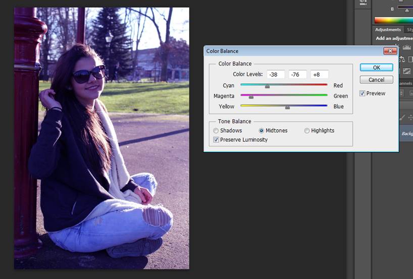 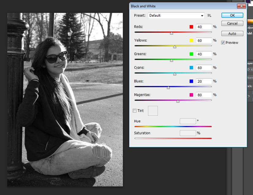 |
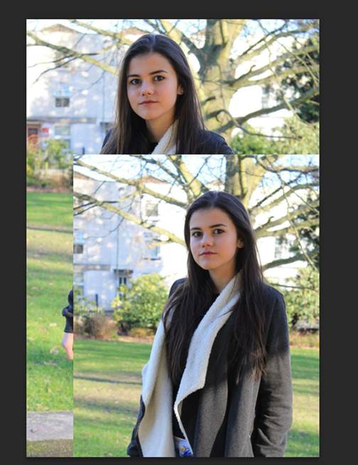
Here are too of my ideas that I have develop and I tried out different colours, to see which one I like more and just playing around with the adjustments.
|
me developing my ideas
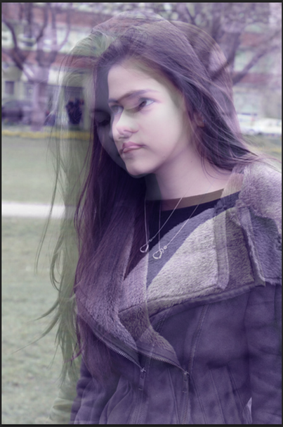


when putting these two photo above together I tried to this idea out with two different types of colours.
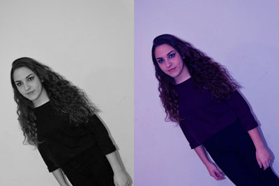
Here is another edit that I did and all my doing getting two of the same photo and just layer them and I put one in white and black and the other one just in colour.
This is to show that I know how to work Photoshop and to adjust the different colours.
Here is another edit that I did and all my doing getting two of the same photo and just layer them and I put one in white and black and the other one just in colour.
This is to show that I know how to work Photoshop and to adjust the different colours.
  |
Here are some edits that I did but I didn't really like them, but I have put the up to show what my ideas are and if I have change them I would show more of my development.
|
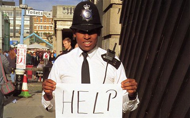
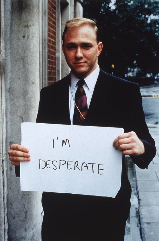
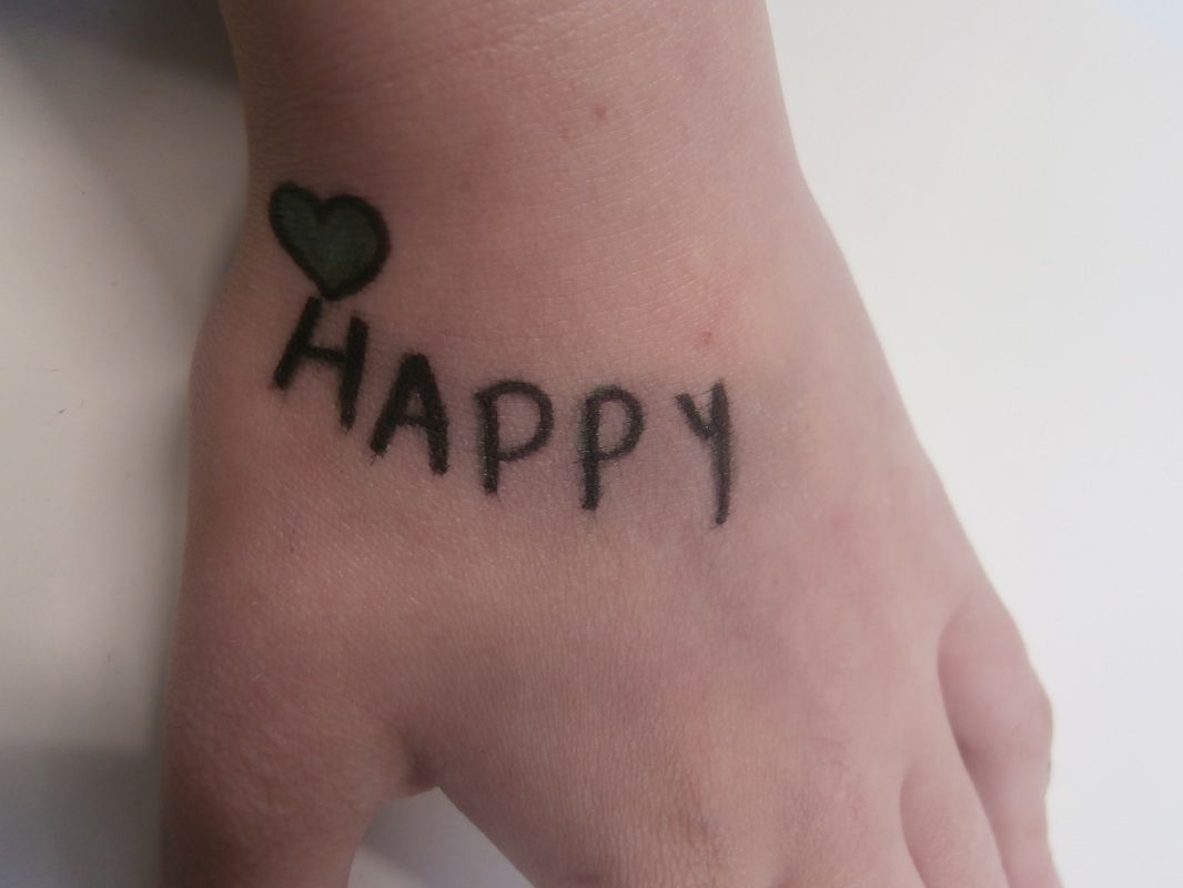
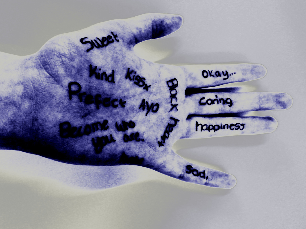
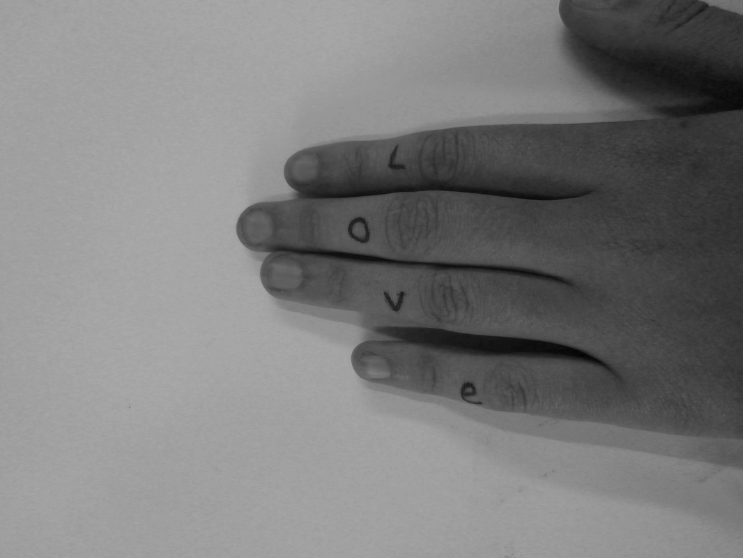
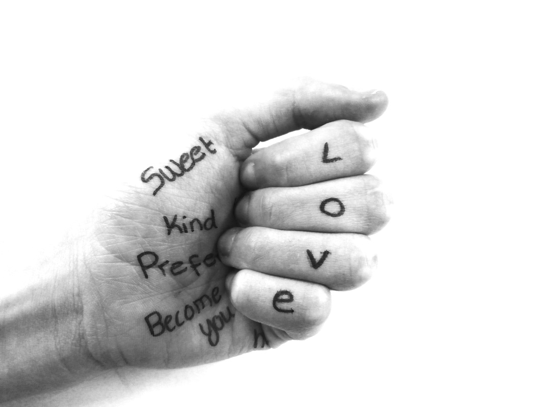
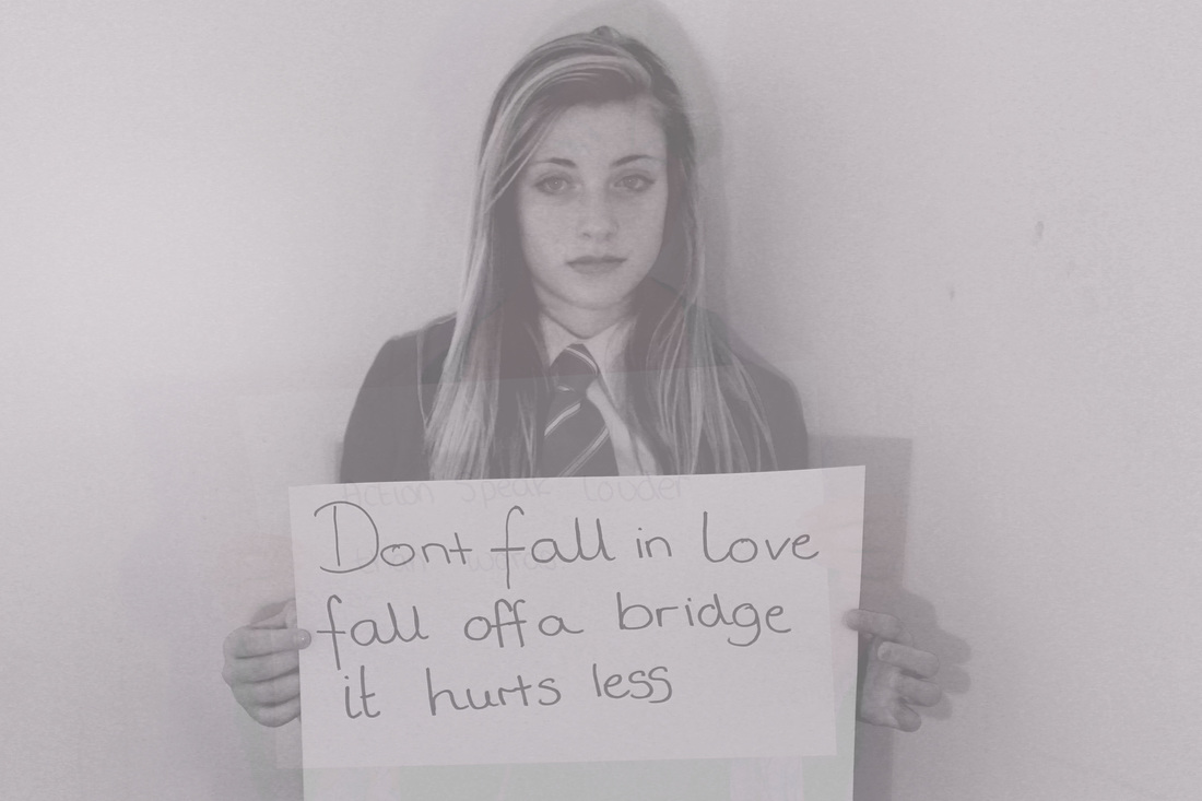
Gillian wearing
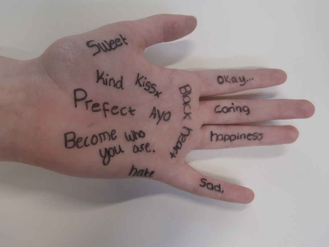
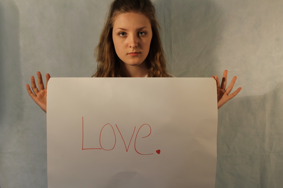
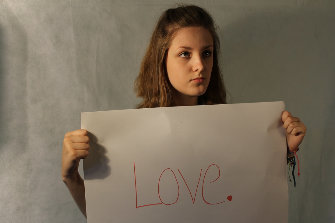
Gillian Wearing first attracted public acclaim when she exhibited this series of photographs at City Racing, a small artist-run gallery in London in 1993. She had been using video and photography since the early 1990s, but this was her first significant collaboration with members of the public. Standing in a busy area of South London, Wearing stopped passers-by and asked them to write down what was on their mind. With their permission, she then photographed them holding their statement. As indicated by the title of the work, Wearing has written that this collaboration 'interrupts the logic of photo-documentary and snapshot photography by the subjects' clear collusion and engineering of their own representation.
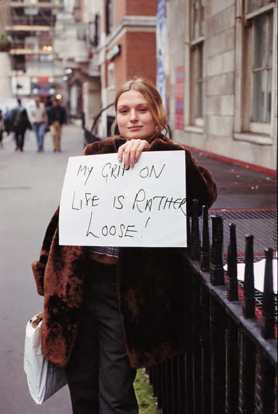
My Response
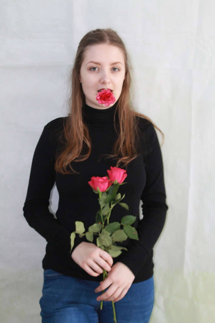
Is all about love and relationship and what it means to different people. I asked them to write it down on a pieces of paper what they think of love, then take photo with holding the photo to express their thoughts.
Is all about love and relationship and what it means to different people. I asked them to write it down on a pieces of paper what they think of love, then take photo with holding the photo to express their thoughts.
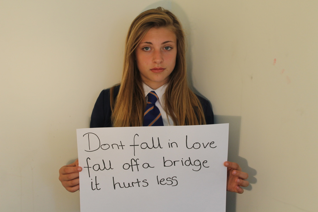
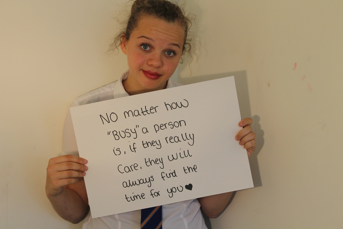
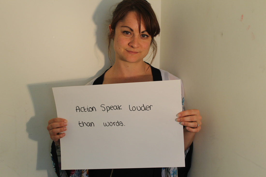
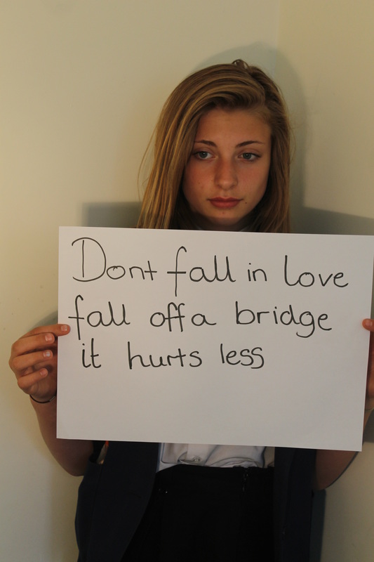

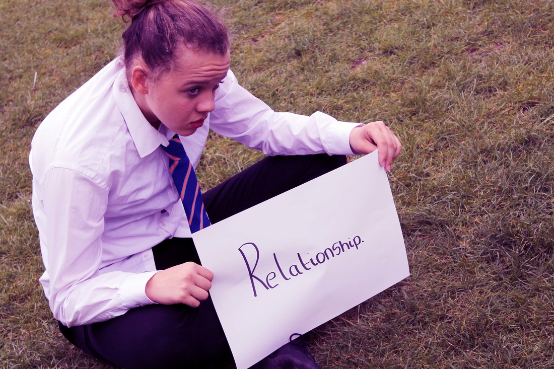
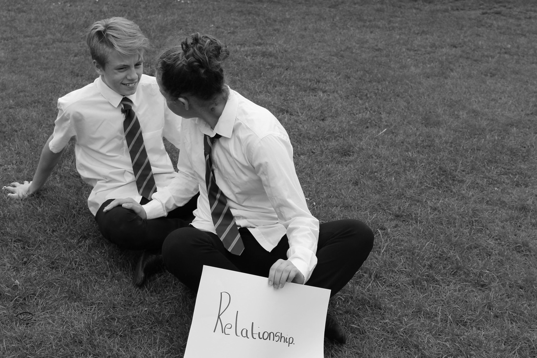
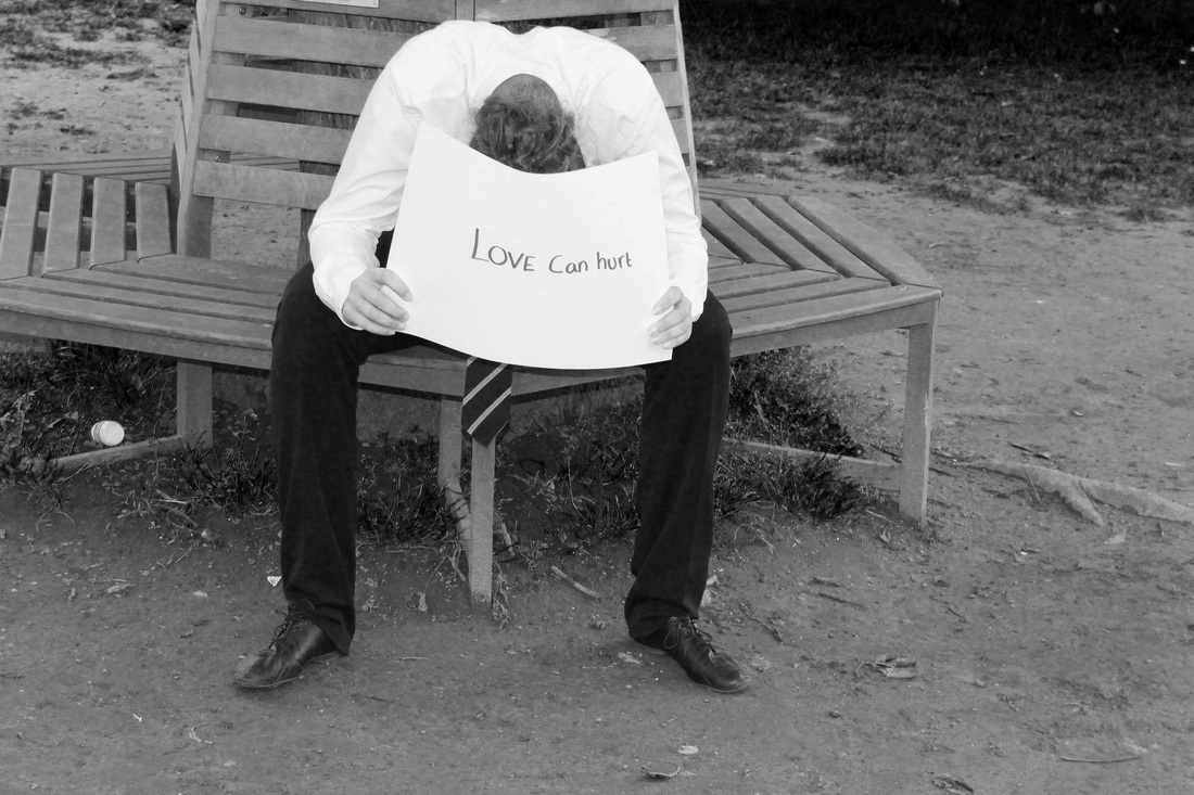
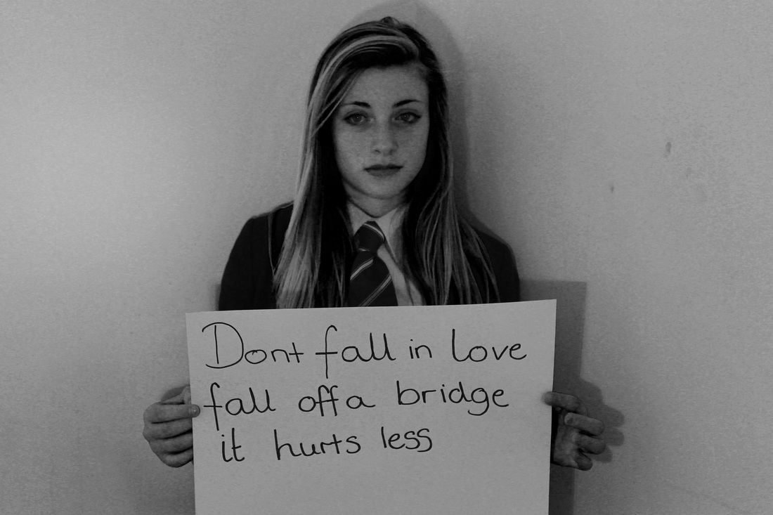
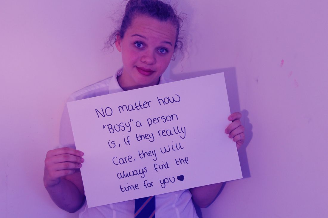
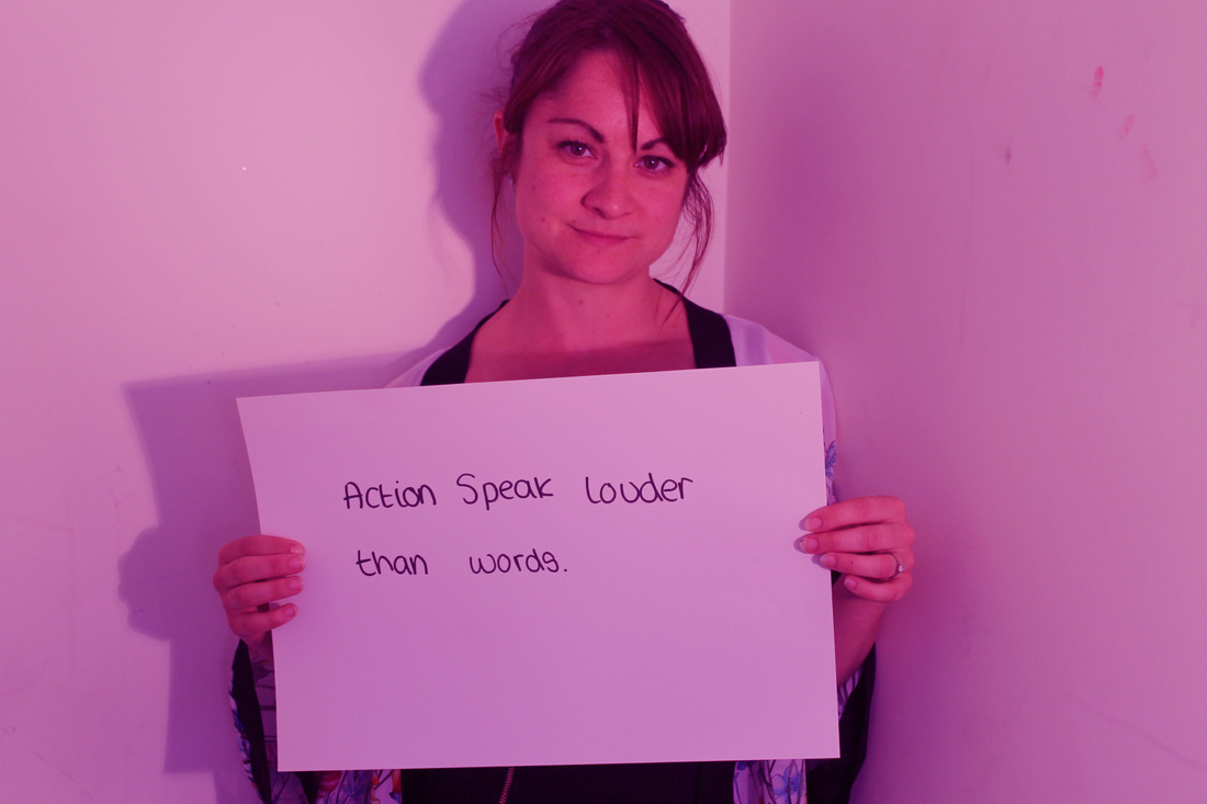
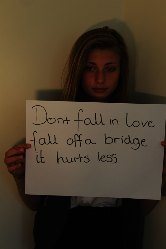
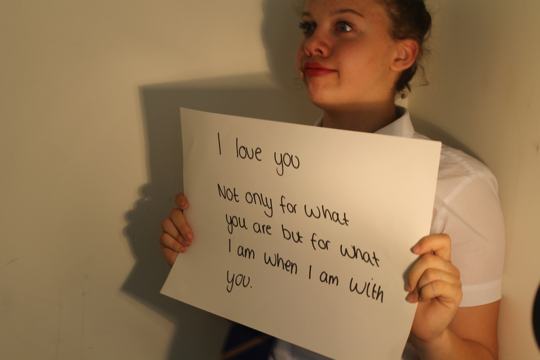
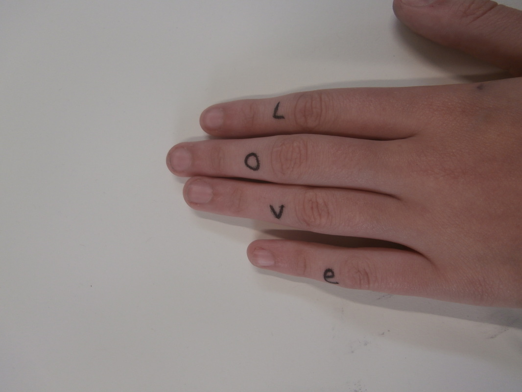
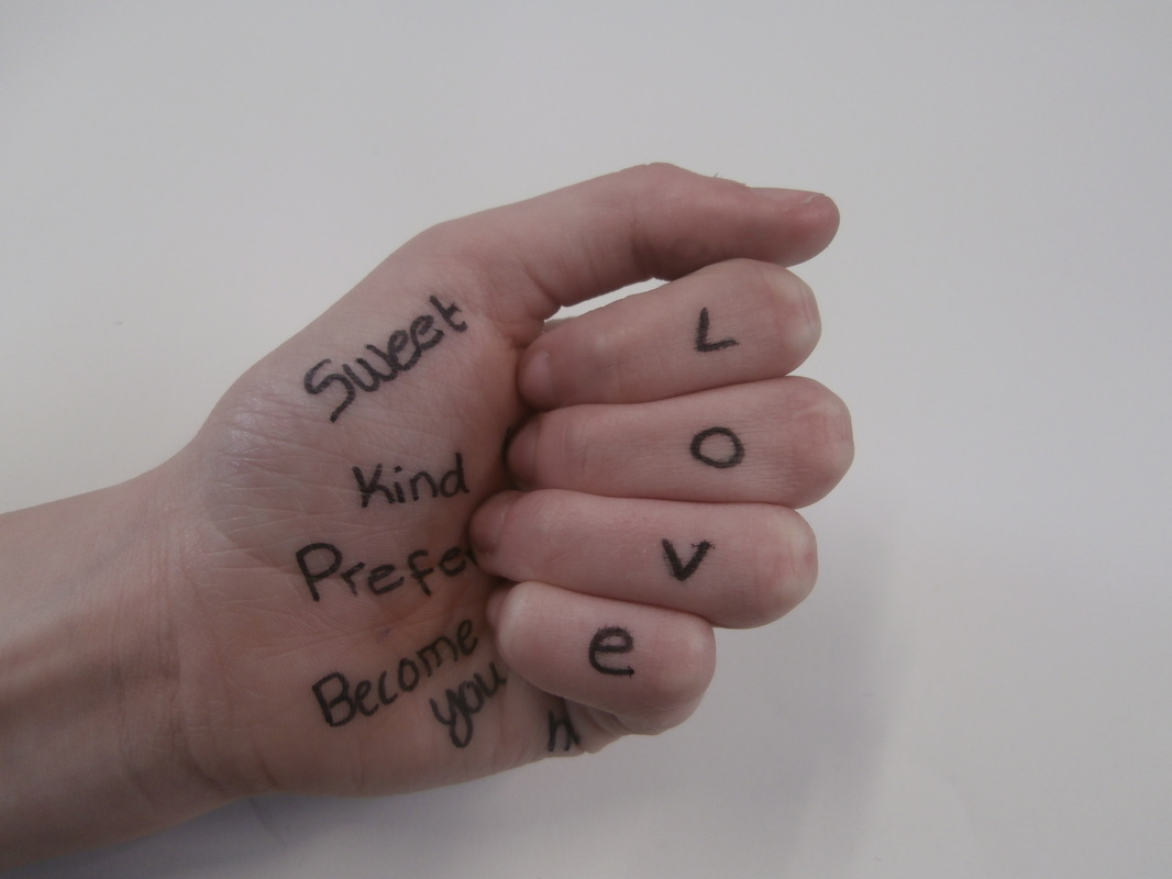
These are my photo that I edited in the style of Gillian wearing.These my edits in the style of Gillian Wearing. The reason why I choose love and relationship is because love means so much to everyone even not many people believe in it. Love means different to different people.
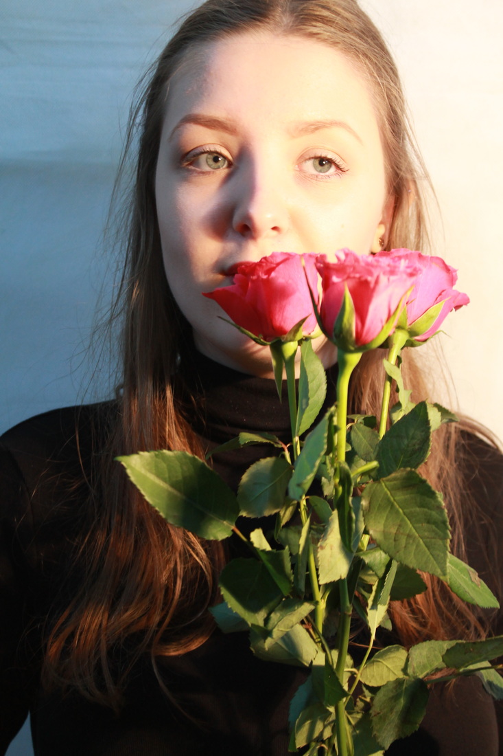
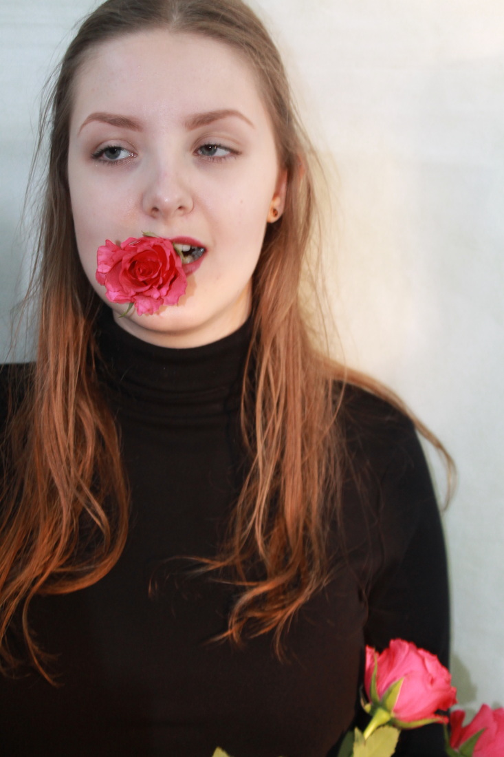
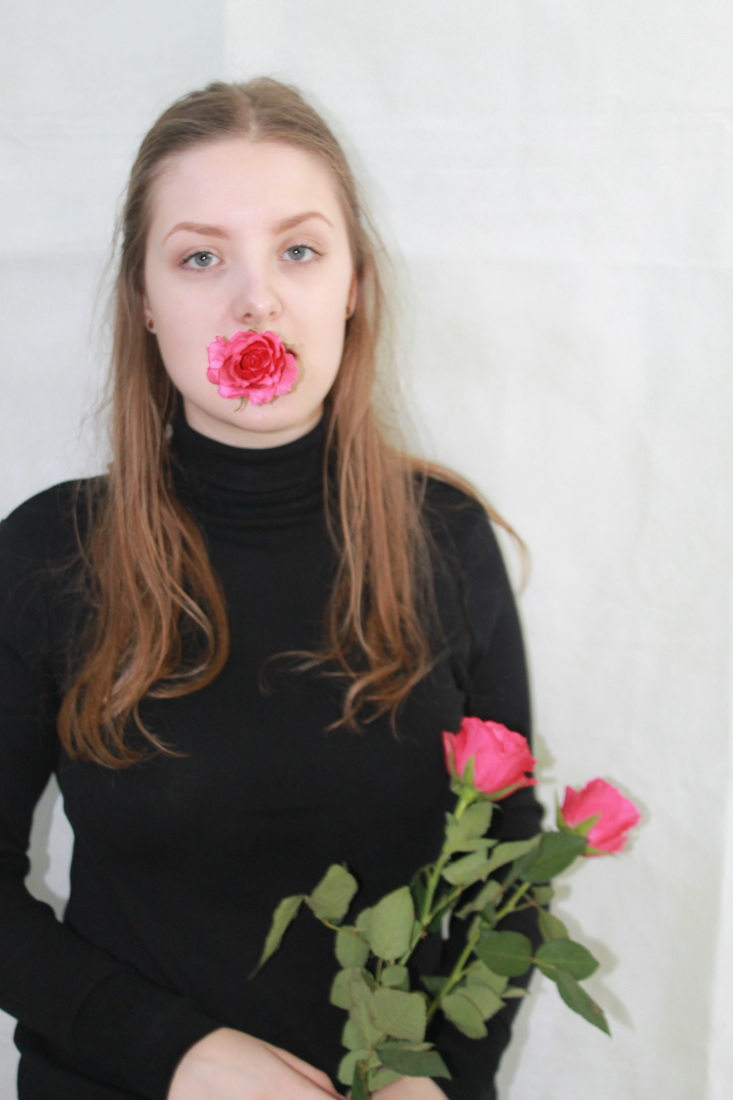
photo shoot exploring romance


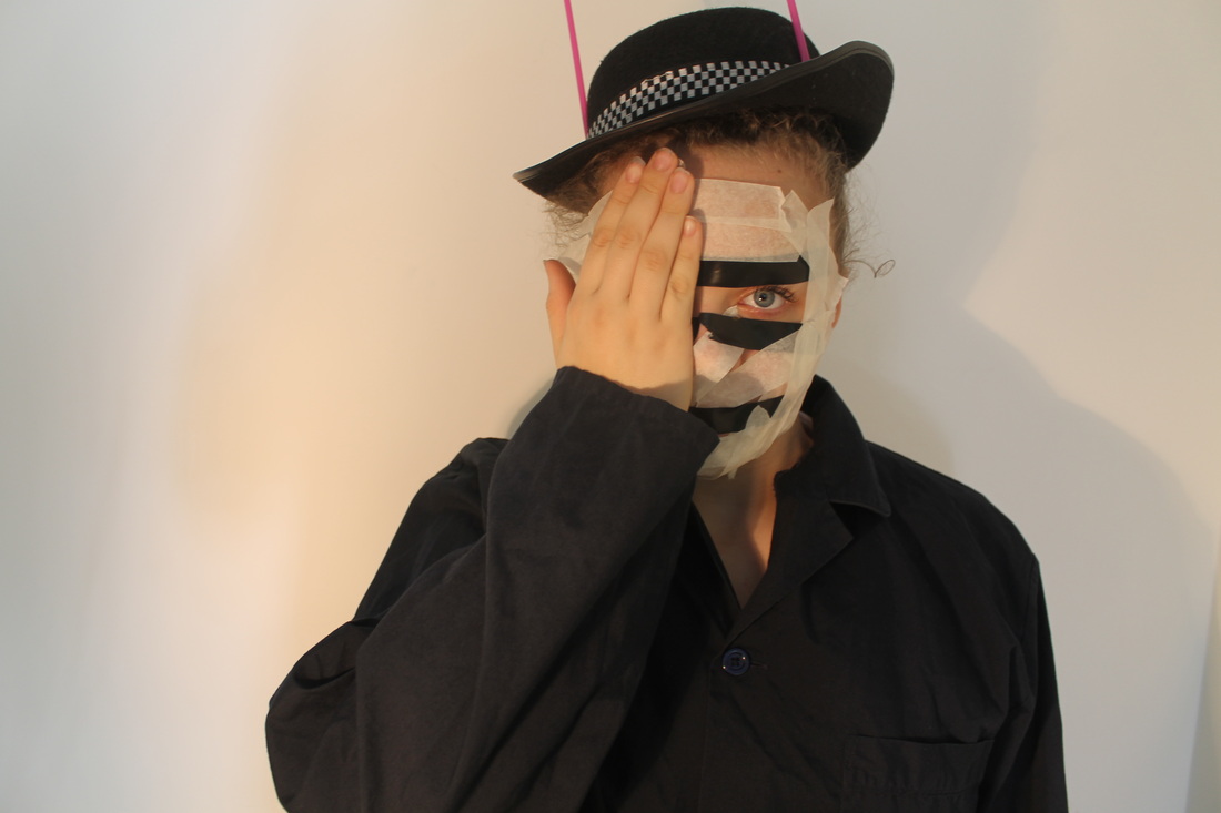
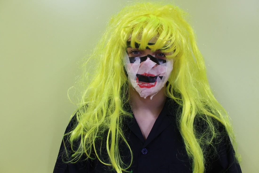
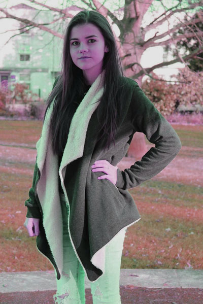
Stefan sagmeister
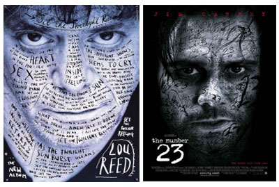
My photo and my edits in the style of stefan sagmeister. My theme is about love relationship.
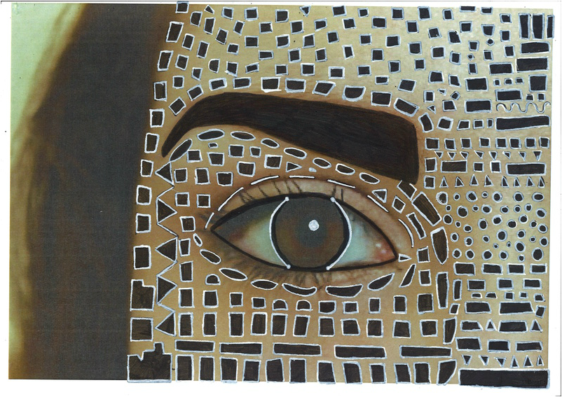
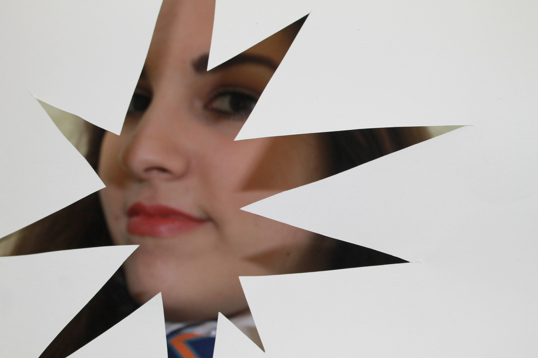
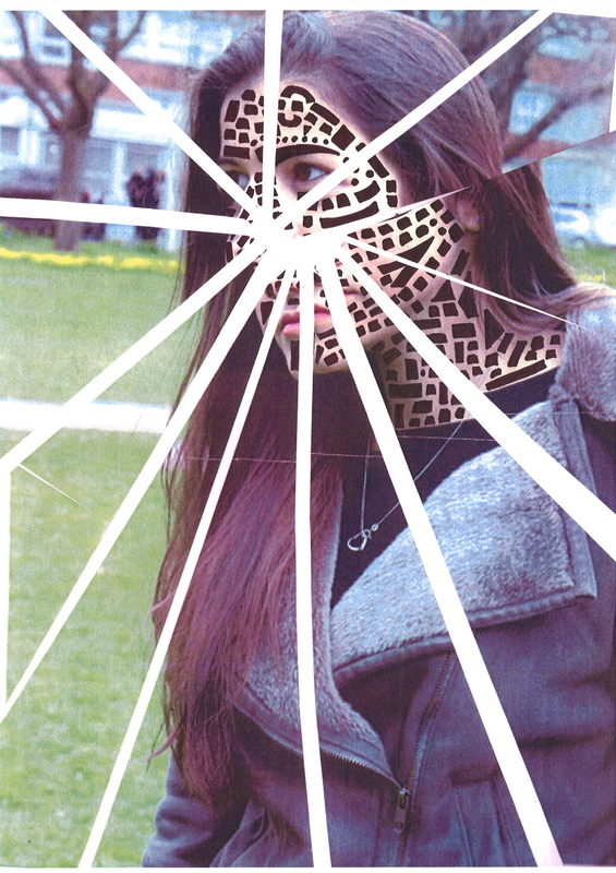
Here is an image that I took and then printed it out. I did this because I have been looking at Stefan Sagmeister. I have been looking at his work and it had given me an idea to create this image using shape.
|
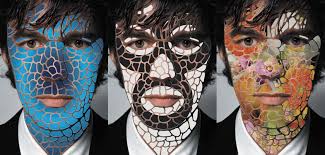
Here is another piece that I did in the style of Stefan Sagmeister. I really like how the black and white shape goes over and covers the face. It makes it look different and not something you see everyday, however I do think my first one is better then my second one. Here I used big and small shapes to fill her face instead of doing loads of small little shapes, which would take a long time and going over it with white pen again around the black line, so then turn it into white out line.
|
|
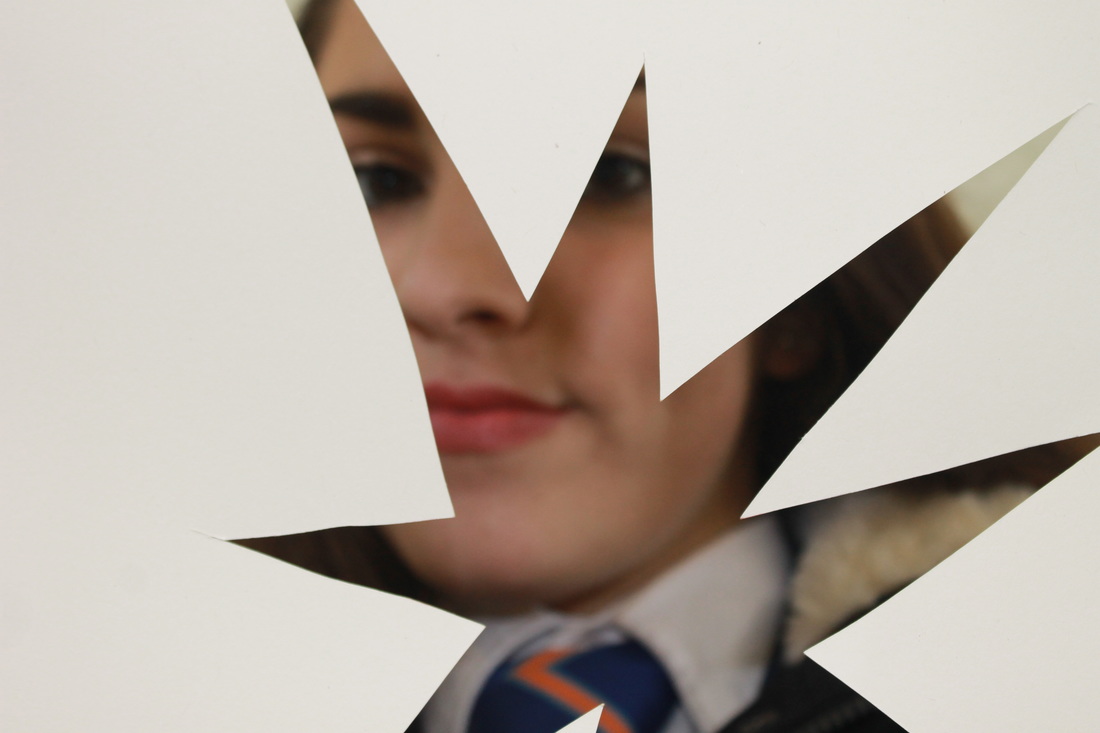
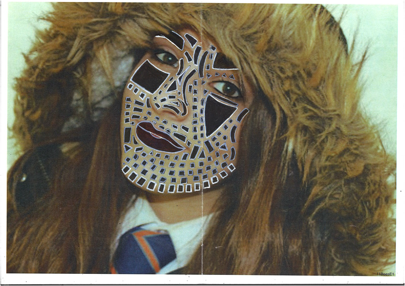
Here I did my third one, which is the same idea so with the black coloured in shape gone over the with a white out line pen. however this time I went down to the neck because I wanted to cover were ever there were skin showing. I really like this one because although it has the make style a my other pieces. There are different range of shape and sizes with this picture.
|
|
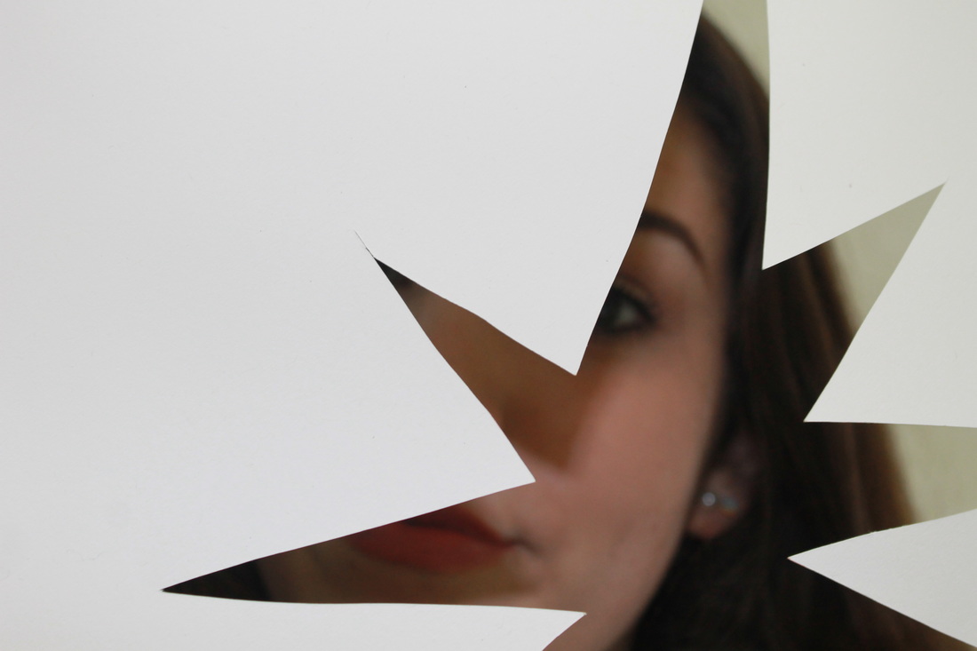
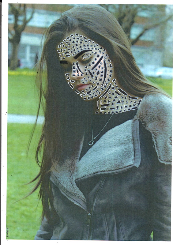
This is my froth one of doing and it is different although I still did the black shapes big and small I didn't put the white out line on because I wanted to see what the image created without the white line However in the picture I meanly used big shapes one because I didn't have enough time and second was because I wanted to try it and see what it looks like. This image is still in the style of Stefan Sagmeister. But I just wanted to try it without the white lines
|
|
|
Stefan sagmeister was born August 6, 1962) is a New York-based graphic designer and typragrapher. Sagmeister co-founded a design firm called Sagmeister & Walsh Inc.Solo shows on Sagmeister, Inc.'s work have been mounted in Zurich, Vienna, New York, Berlin, Japan, Osaka, Prague, Cologne, and Seoul. He teaches in the graduate department of the school of visual arts in New York and has been appointed as the Frank Stanton Chair at the cooper union school of arts New York. Sagmeister goes on a year-long sabbatical around every seven years, where he does not take work from clients. In 2005, Sagmeister won the national design for Communications from the cooper-Hewitt national design museum.He has spent many years designing for the music industry. Several years ago he decided to dedicate 25% of his work to the art world, things like books and publications for galleries, another 25% to the scientific community, 25% to social causes, and the remaining quarter has stayed dedicated to the music industry.
This is some of he's own work/photo.
This is some of he's own work/photo.
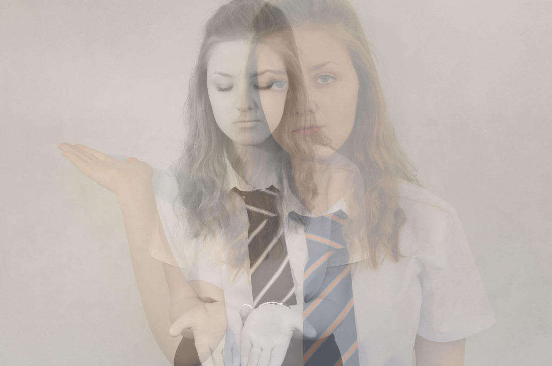
Developing my IDEAS
developing MY IDEAS USING THE MERGE TOOL ON PHOTOSHOP

    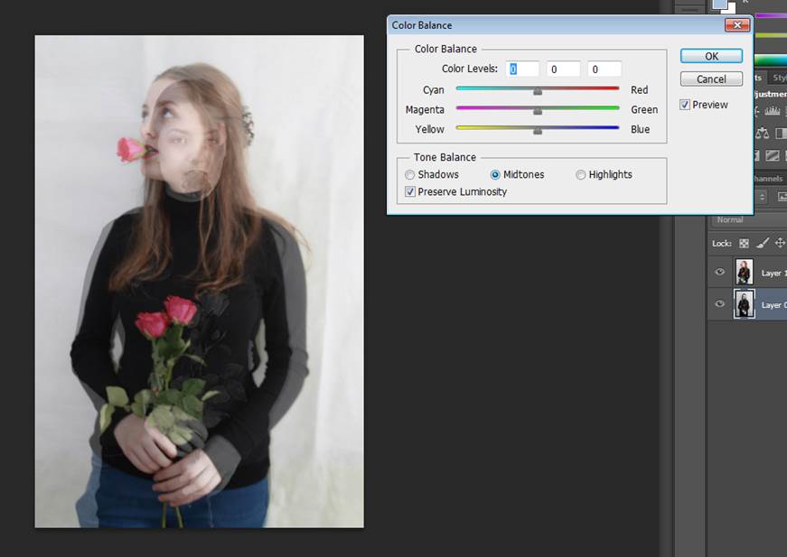 |
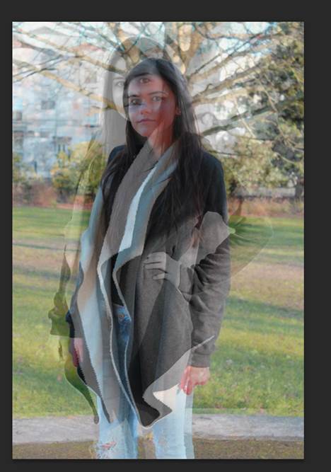
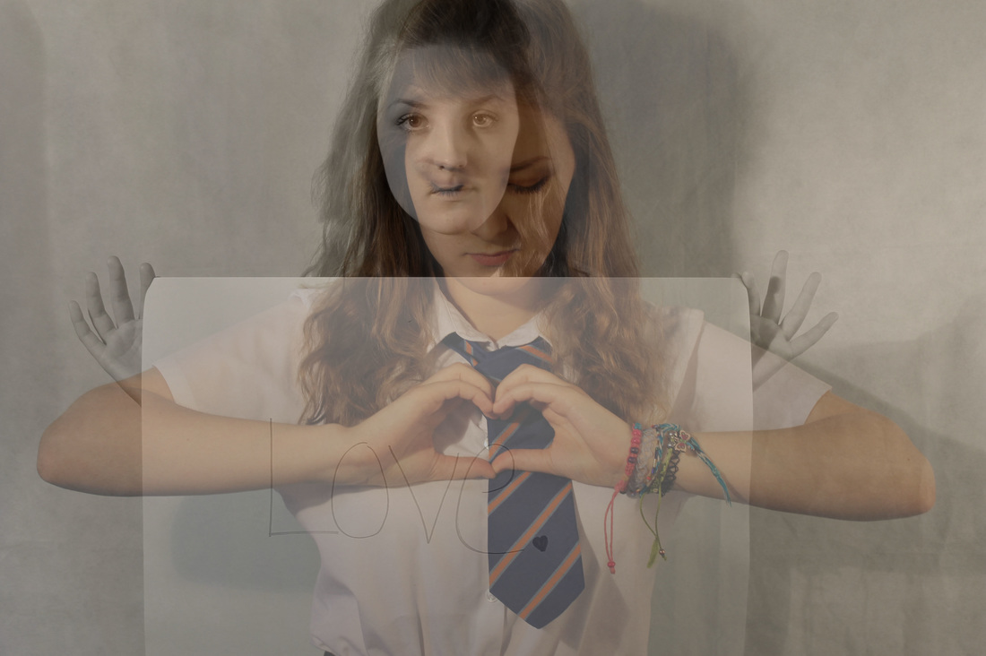
Here is a step by step on how I created the two photo from above into one.
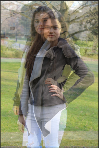
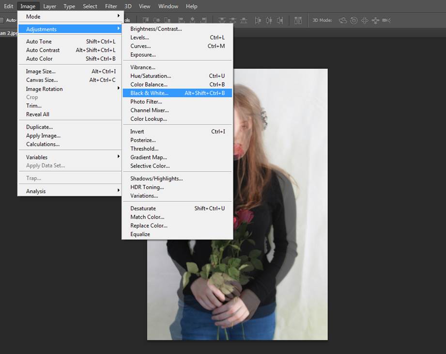
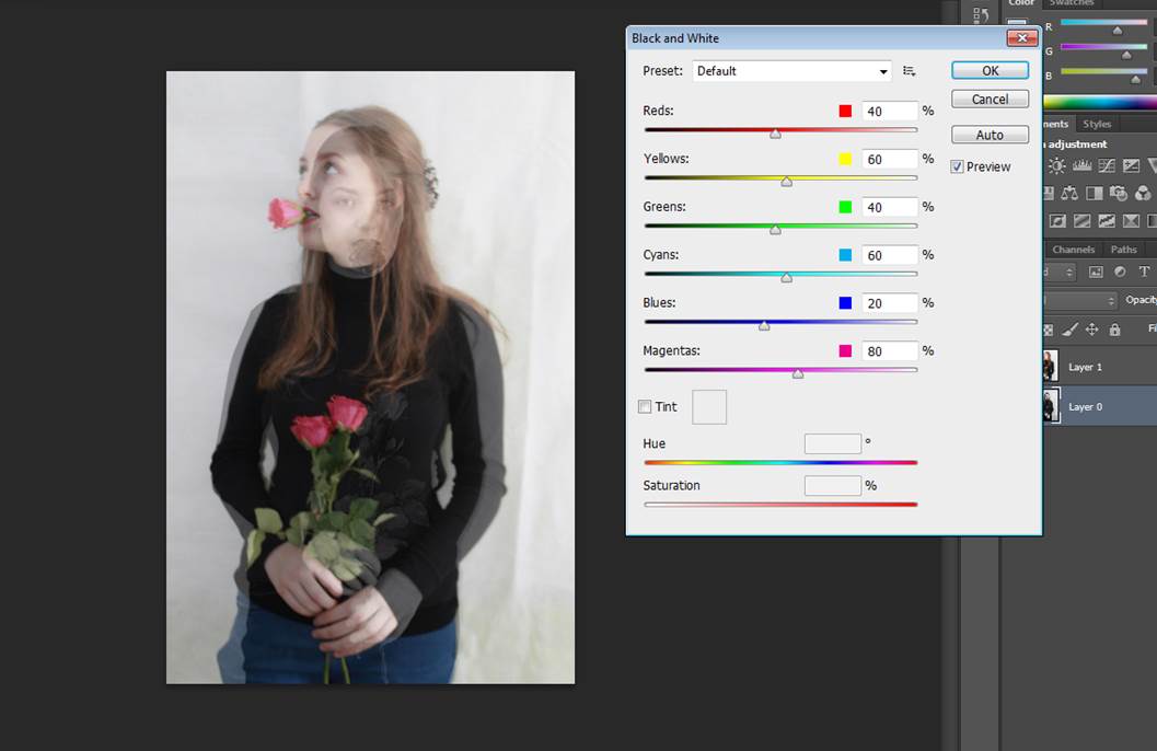
1. first I select to two that I wanted and put them on two on Photoshop. 2.Then I put the photo that I think best at the front and the other one as the background, then changed the opacity of the front layer so you can see the other image coming through. 3. Then front layer I went images, adjustments and then selected black and white. And played around till I got the right balance of the black an white how I want it. 4.For the front layer I did the same but instead of the adjustment being black and white, I chose colour balance. this way you can change the colours of the photo to match the black and white adjustments. 5.Then once you did all of this it created an image. Like this below. |
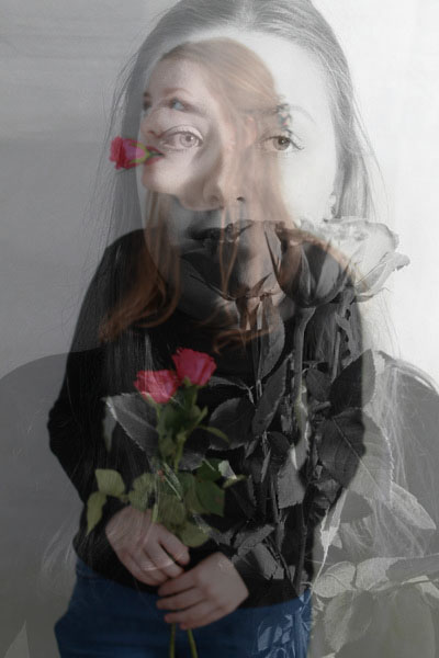
my first final piece

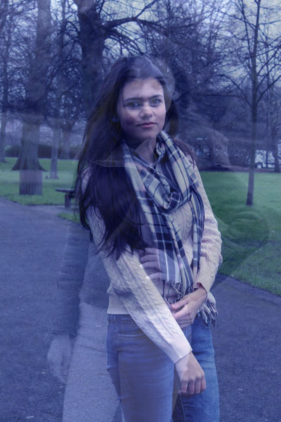
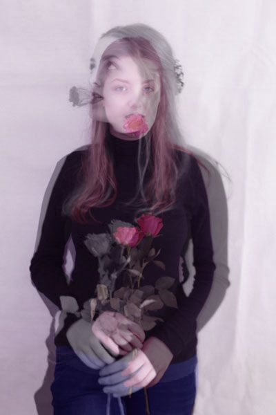
My 2nd final piece

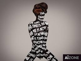
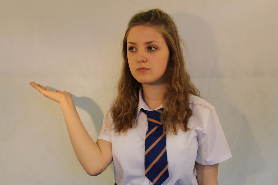
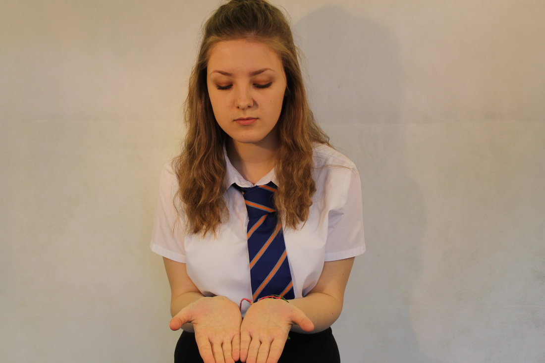
I have chosen this photo that I edited because its shows what my whole project is about. My project is all about love and relationship and in the picture it shows that a person has had bad relationship and that now she happy and she has become a more strong and a independent woman because in the black and white photo she has her eyes looking down and her hands out in front of her, which shows that need help and it looks like she doesn't want to be here. However in the second photo she looks much happy she has her eyes open and one of her hand up to show that she has moved on and now she is in a happy and healthy relationship.
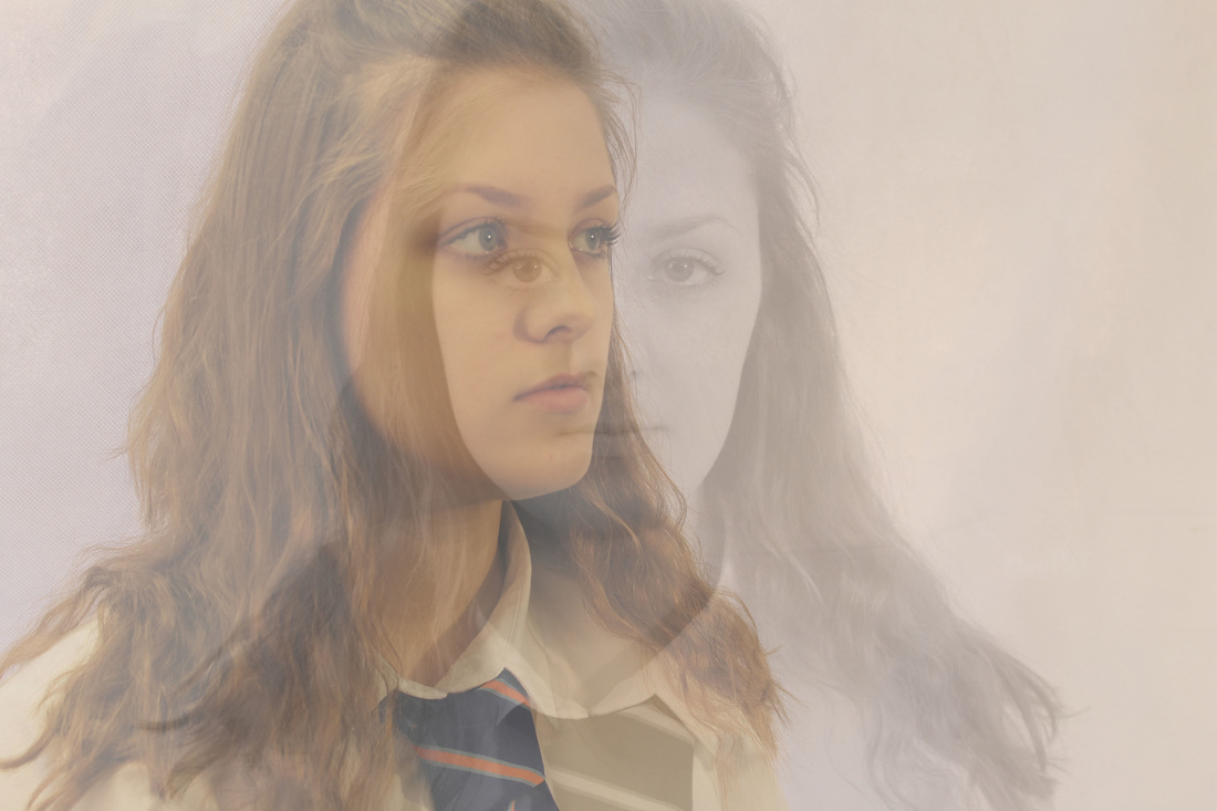
I really like how the black and white effect has mixed in nicely with the normal colours to show that there is two photo in this picture.
I really like how the black and white effect has mixed in nicely with the normal colours to show that there is two photo in this picture.
evaluation
I picked this for my final piece because I like how both of the two photos work together and the colours, it also creates an image of a young girl who has not had a not good past, she has her head down and never looks up, this is because she is sad and has lost hope. In the second photos she is standing up for herself and becoming a strong independent young women who is feeling confident about herself and the future is looking better for her because she has made a change.
